The production pipeline
The useful way to read The Grand Budapest Hotel is not as a triumph of prettiness. It is a triumph of pipeline design. Wes Anderson's 2014 film looks weightless because so much of it was built, painted, dressed, scaled, photographed, and timed with unusual material discipline. The production does not hide its artificiality. It makes artificiality operational, turning a hotel that never existed into a machine for memory, comedy, class ritual, and historical loss.
That matters because the movie arrived deep inside the digital era, when lavish screen worlds could be expanded by invisible compositing and generic polish. The Grand Budapest Hotel chooses a different industrial logic. Its signature technology is not one tool. It is the coordination of old tools: a real German department store, miniature architecture, painted landscape sources, dense set decoration, graphic design, costume color, and a camera grammar that keeps changing shape with the story's time periods. BFI's Sight and Sound file lists the film in three ratios: 2.35:1, 1.85:1, and 1.33:1, and notes that the ratios differentiate the film's main timelines.[1]
Built into Goerlitz
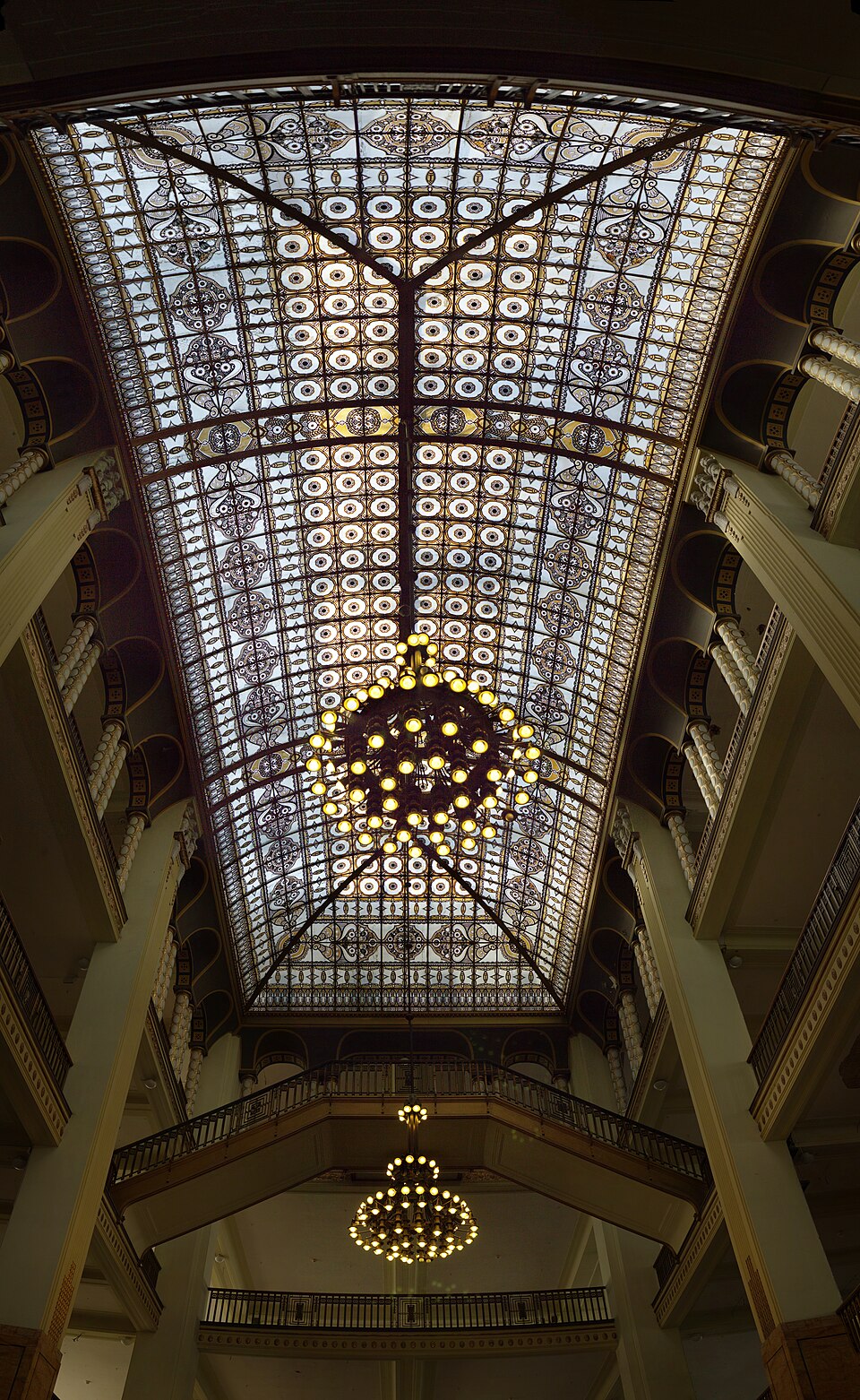
The core location gives the method away. In interviews after the film's awards run, production designer Adam Stockhausen described Goerlitz as the center of the shoot once the team found the department store. National Geographic's interview is blunt about the practical conversion: a vacant building became the production's home base, with offices upstairs and the interior turned into the Grand Budapest lobby.[3] The Credits interview gets more specific about why that mattered. The store already had the structural bones the design team wanted, including an atrium, railings, and windows; then the crew built into that existing shell.[2]
That phrase, "built into it," is the film's whole engineering principle. Anderson's world often gets described as dollhouse-like, but a dollhouse is too static a metaphor. The hotel works because the real and the fabricated keep pressing against each other. The Goerlitz atrium supplies vertical space, open galleries, and a legible civic scale. Stockhausen's team then turns that found architecture into a theatrical system: corridors become room fronts, rails become chase geometry, and the lobby becomes a station where etiquette, surveillance, employment, romance, and panic can all pass through the same volume.[2][3][4]
This is why the film's artificiality feels tactile instead of hollow. The pink facade, the uniforms, the pastry boxes, the prison, and the alpine fantasy do not ask to be mistaken for unstaged reality. They ask to be believed as components in a designed historical memory. Vice's interview with Stockhausen describes the hotel as a combination of the Goerlitz department-store interior, a miniature model, and landscape painting, with research ranging from Eastern Germany and the Czech Republic to Library of Congress photochrom postcards.[5] The production did not copy one building. It made a plausible composite of nostalgia.
Handmade artifice under historical pressure
That composite has a political edge. The film's invented Republic of Zubrowka is not a neutral storybook country. The hotel moves from old-world luxury to later drabness, while violence, confiscation, border control, prison, and fascist-coded power seep into the comedy. The Guardian's production-design piece captures that contrast through the vibrant concierge desk, the 1960s lobby colors, and the shift from pastel hospitality to grey-black occupying force.[6] The industry lesson is that production design can carry historical argument without becoming an illustrated lecture. A sign, a uniform, a desk, a train compartment, or a hotel corridor can mark the shift from cosmopolitan manners to administrative threat. The set is not background. It is governance made visible.
Aspect ratio as archival technology
The changing aspect ratios sharpen that governance. The 1930s material is boxed into a near-square frame, which makes the lobby and corridors feel like miniature stages. Later periods open differently, as if each era has its own archival container.[1] This is not just cinephile ornament. It helps the viewer understand that the film is narrated through layers: the author, the older Zero, the younger Zero, and a vanished hotel culture being reconstructed after the fact. Format becomes a technology of distance.
Miniature work extends the same idea. The film's famous exterior hotel is not merely a cute object. It makes the hotel legible as a perched fantasy, a mountain resort seen at the scale of memory. A fully realistic digital hotel would have solved a rendering problem while weakening the film's emotional logic. The miniature tells the viewer that this place is already half-recollection. Its charm depends on edges, proportions, and handmade pressure. Anderson wants the viewer to feel the model's constructedness because the story itself is about a constructed memory trying to outlast barbarism.
Why the old tools still feel modern
The industry's attention to the film's design was not incidental flourish. Vice reported during awards season that Stockhausen was up for an Academy Award for Best Production Design, while BFI's production file places Adam Stockhausen, Milena Canonero, Robert Yeoman, Barney Pilling, and Alexandre Desplat together in the same visible craft spine.[1][5] Those credits are usually separated by department. In this film, they are also evidence of system integration. The production design does not work without the costumes. The costumes do not work without the graphic props and color fields. The score does not work without the film's mechanical tempo. The acting style needs the architecture's precision.
The strongest counterargument is that Anderson's method can feel sealed off, too composed, and too fond of surface. That is a fair risk in his cinema. But The Grand Budapest Hotel succeeds because its surfaces are under pressure. The lobby is beautiful, yet it is also a workplace. Gustave's manners are comic, yet they are also a fragile code of care. The pastry box is charming, yet it becomes a carrier for contraband and loyalty. Design keeps flipping from decoration into function.
That is the film's durable industrial lesson. Handmade design does not have to mean anti-technology nostalgia. In The Grand Budapest Hotel, handmade design is the technology. The physical set gives actors and cameras a spatial contract. Miniatures give the world memory-scale. Aspect ratios organize time. Props carry institutions in miniature. The result is a modern film that uses old craft not as retro styling, but as a high-control production system for making loss visible.
Sources
- BFI Sight and Sound, "Film of the week: The Grand Budapest Hotel" (2014) - film review, credits, aspect ratios, and timeline-ratio note.
- The Credits, "The Grand Budapest Hotel Production Designer Adam Stockhausen Goes Handmade" (2014) - interview on the Goerlitz department-store build and production-design process.
- National Geographic, "Oscar-Winning Art Director on Creating the Grand Budapest Hotel" (2015) - interview on filming in Goerlitz and transforming the department store.
- Wikimedia Commons, "File:Altes Warenhaus Gorlitz, Panorama innen.jpg" - 2015 photograph of the old Goerlitz department-store interior used as image source.
- Vice, "We Talked to 'The Grand Budapest Hotel' Production Designer About Pastries, Postcards, and Taxidermy" (2015) - interview on the department store, miniature, landscape paintings, photochrom research, and design problem-solving.
- The Guardian, "Wes Anderson, the film director who designs just-so stories" (2014) - production-design feature on color, miniatures, staged movement, and the 1930s-to-1960s hotel transformation.