
A fictional city needs laws, advertisements, street names, transit notices, cereal boxes, newspapers, receipts, office forms, and private letters long before it needs a logo. Most of those things will never receive a close-up. They still have to agree about where and when the story takes place, who holds power there, what can be bought, and what its residents consider ordinary. Film graphic design builds that agreement.
The craft is easy to miss because the most persuasive graphic prop does not ask to be admired as design. It behaves. A billboard closes the blank edge of a stadium. A passport survives an actor's grip. A menu opens to the right period and price level. A handwritten note gives a performer something more specific than an empty rectangle to read. Screen Ireland's National Talent Academies breaks the field into signs, labels, newspapers, documents, and ephemera, then follows them from script and research through camera legibility and physical fabrication.[6]
The two videos below reveal the same job at opposite scales. The Academy's short portrait of Martin T. Charles makes film graphics look architectural: large-format printing, environmental surfaces, branded places, and deadlines measured against a shooting crew already in motion.[1][3] CreativeMornings' talk with Annie Atkins moves inward, toward telegrams, packaging, period ephemera, handwriting, paper stock, and the physical credibility of an object in an actor's hands.[2][5] Put together, they show that size changes the problem but not the standard. A graphic has to belong to the world, survive production, and communicate at the distance from which the camera will see it.
Martin T. Charles: make a surface behave like a place
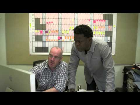
The Academy introduces Charles not as a designer of promotional posters made after a film is finished, but as a maker working inside production.[1] That distinction rearranges the craft. His audience is simultaneously the production designer approving a visual system, the crew installing it, the camera converting it into background or evidence, and the actor moving through the completed space. A sign can be perfectly composed and still fail if its scale dies in a wide shot, its finish catches light badly, or its material cannot be mounted before the location is needed.
Charles's own account gives the short portrait an unusually useful sense of scale. For the baseball drama 42, his team created graphics for ten stadium environments as well as airports, stations, streets, Brooklyn, and Harlem; some stadium advertisements stretched beyond forty feet. On The Newsroom, more than 2,000 square feet of graphics helped turn a set into a legible broadcast workplace from multiple rooms and camera angles.[4] These are not enlarged versions of a page layout. They are pieces of spatial engineering.
At that size, typography has to cooperate with architecture. A word may need to hold together across separate printed panels. A period advertisement must read as part of an old ballpark without turning the stadium into a museum display. Repetition matters: one correctly aged sign surrounded by pristine walls will look like a prop, while a family of related marks can make the whole location feel used. The graphic designer therefore has to think about sightlines, surface texture, installation, weather, lens distance, color response, and what other departments are adding around the work.
Charles describes the creative brief as a conversation rather than a ready-made answer. He listens to a production designer's larger vision, extracts the useful constraints, researches the period, and develops new material instead of treating old project files as a warehouse of interchangeable solutions.[3][4] That refusal to recycle is not preciousness. A plausible 1940s stadium advertisement and a plausible contemporary cable-news wall may use some of the same machines, but they belong to different economies of attention. One should look accumulated and local; the other must project a deliberately managed institutional identity.
The Academy video also helps restore labor to images that finished films present as atmosphere.[1] Wide graphics require proofs, color decisions, substrate choices, printing, trimming, transport, installation, and sometimes replacement. A camera may reduce days of that work to a two-second pan. Yet the pan only feels effortless because the environment does not suddenly announce where the set ends and the graphic begins.
This is the first lesson of the collection: background is not the same as unimportant. Large film graphics organize peripheral vision. They tell viewers what kind of institution they have entered before dialogue explains it, and they give performers a room with social rules already written onto its surfaces.
Annie Atkins: make the small object survive touch
Atkins begins from a complementary definition. Film graphics include the pieces actors read, carry, fold, tear, post, exchange, or leave behind. In her CreativeMornings talk, she moves through graphic props and set pieces made for television and feature films, from The Tudors and The Boxtrolls to The Grand Budapest Hotel.[2] The range matters because graphic design on screen is not a single layer. It moves between intimate evidence and environmental noise.
The crucial shift in Atkins's talk is from image to object. A letter is not finished when its type looks period-correct on screen. It still needs paper with the right weight, margins that make sense for its sender, folds produced by use rather than by a texture filter, and enough legible content for the actor to respond to it. A newspaper may need a convincing front page for the camera, interior pages for the person opening it, multiple copies for repeated takes, and a version whose wear matches its point in the story.
That physical depth changes performance. In Atkins's account of background documents for Bridge of Spies, the pages most exposed to view received legible copy, typed notes, stamps, and carefully chosen stocks even when the audience was unlikely to inspect them closely.[5] The immediate beneficiary was not only the lens. Cast and crew could handle something that behaved like a document rather than a decorated placeholder. Phaidon's description of Atkins's work makes the same point: the authenticity of invitations, tickets, packaging, letters, and other fleeting objects helps move both performer and viewer farther into the fiction.[8]
Research supplies the grammar, but research alone does not make the object alive. Atkins collects real ephemera because old print carries decisions that a modern designer would struggle to invent innocently: narrow margins caused by economy, obsolete abbreviations, uneven ink, unfashionable type combinations, paper chosen for price rather than elegance, and marks left by storage or handling.[5][8] The purpose is not to fetishize age. It is to recover the unselfconscious design habits of a world before the film crew arrived.
Then comes controlled imperfection. A prop made yesterday may need to look as if it passed through a pocket, office, prison, hotel, or household for years. Patina can help, but indiscriminate distressing merely replaces one visual cliché with another. A love letter should age differently from a street poster. A passport accumulates wear at edges and folds; a fresh telegram may be clean but mechanically typed; a bakery box can carry grease, pressure, or a ribbon's crease. The mark has to imply an action.
Continuity turns those marks into production data. Because films are usually shot out of story order, the same prop may need several states: sealed, opened, stained, damaged, repaired.[5] The National Talent Academies outline usefully treats script breakdown, research, digital design, and camera-ready fabrication as one connected workflow.[6] Beauty is only one deliverable. The department must also know which version belongs to which scene, how many duplicates are safe, and whether a hero copy can survive another take.
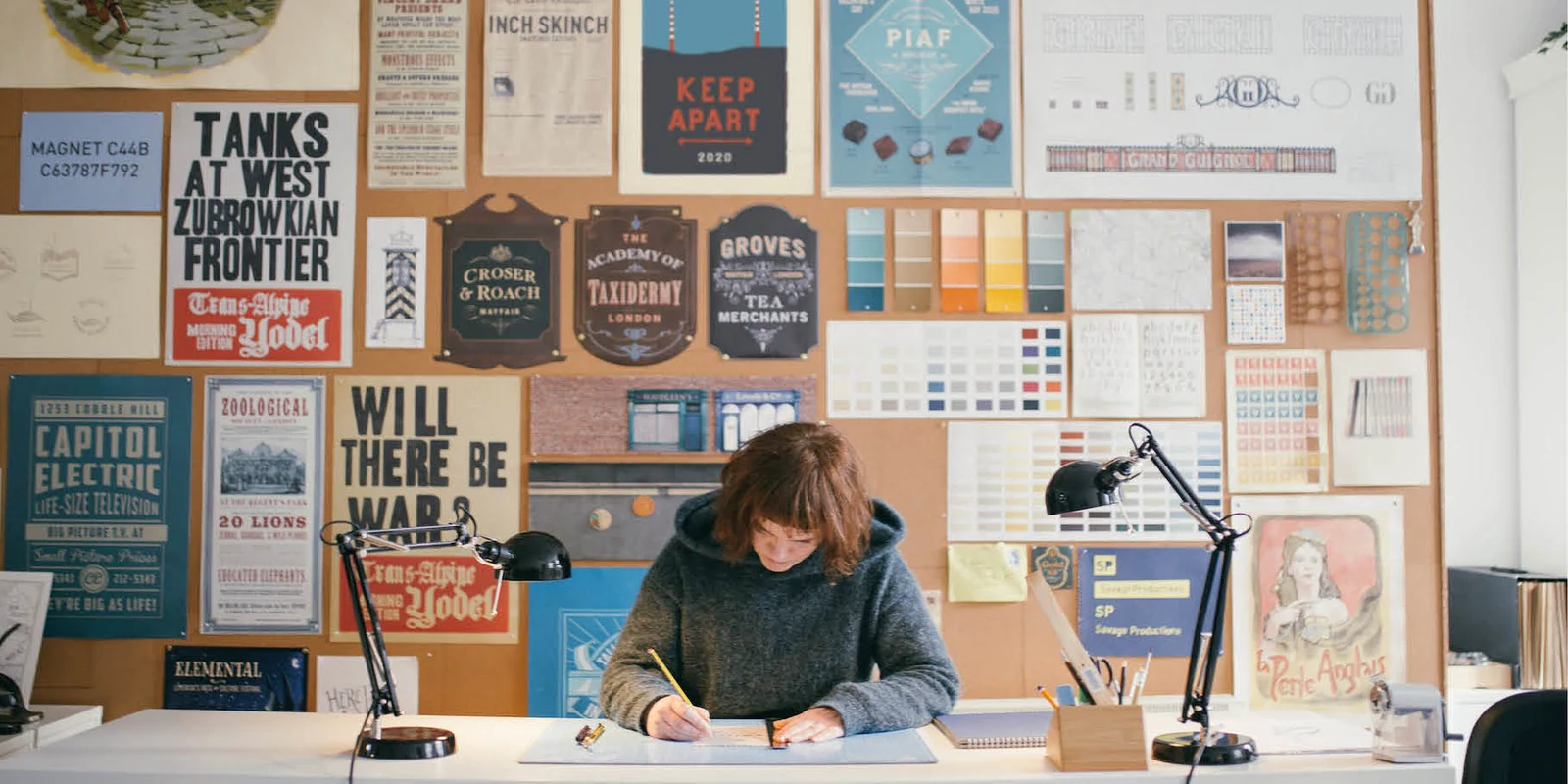
The Monotype photograph used as this article's cover catches that material intelligence in miniature. Atkins sits with paper, tools, printed reference, and the ordinary mess of fabrication around her.[7] Nothing in the image resembles the frictionless idea of a finished file. It shows a designer at the point where typography becomes cutting, gluing, staining, folding, and judgment by hand.
The camera decides which truth has to hold
Charles and Atkins make scale look less like a spectrum than a change in viewing conditions. A stadium advertisement has to establish a period and place before the audience reads its words. A letter may have to withstand a close-up in which one line becomes plot. One is judged across distance; the other through touch. Both begin with the same questions: Who made this inside the story? What resources did they have? Who was meant to see it? How old is it now? What has happened to it since it was new?
Those questions prevent graphic design from becoming decorative world-building. A fictional corporation should not merely possess a handsome mark; its forms, signage, uniforms, packaging, and internal notices should reveal how the institution communicates and whom it expects to obey. A newspaper is not just a masthead; it is a hierarchy of public importance. A handwritten note is not simply calligraphy; it is a person deciding what can be said, on whatever paper is available, under a specific pressure of time.
The craft also exposes why factual accuracy and cinematic credibility are related but not identical. Exact period research can produce a prop whose fine detail disappears at the intended lens distance. A historically available typeface can still be wrong for the class, region, or institution represented. Conversely, a slightly amplified sign may communicate a real environmental hierarchy more honestly to the camera than a timid replica. The designer's task is not to falsify research, but to translate it through scale, light, movement, duration, and story emphasis.
That translation remains collaborative. The production designer sets the larger visual argument; the art director turns it into schedules and builds; prop, set-decoration, scenic, construction, camera, lighting, costume, and continuity teams all place demands on the graphic object.[3][5] A finished piece succeeds when those demands stop looking like compromises and begin to feel like one inhabited world.
Seen together, the videos make invisibility look like an active achievement. Charles's enormous surfaces disappear into places. Atkins's exacting paper objects disappear into use. Their work is noticed most clearly when it fails—when a sign floats above a set, a newspaper contains nonsense, a supposedly old letter feels freshly printed, or an actor holds a prop that has nothing to tell them. When it succeeds, the audience simply believes there was a world before the scene began, and that the world had already been printing itself.
Sources
- The Academy, “Credited As: Graphic Designer,” YouTube video — a short profile of Martin T. Charles and graphic design inside film production.
- CreativeMornings HQ, “Annie Atkins: Designing Graphic Props for Filmmaking,” YouTube video — a practitioner talk on graphic props, material construction, and screen storytelling.
- Martin T. Charles, “The Art of Design for Stage and Screen,” Roland DGA, January 29, 2013 — first-person account of creative briefs, large-format work, tight production deadlines, collaboration, and the choice not to recycle earlier designs.
- Roland DGA Corporation, “Graphic Designer Martin T. Charles of SagaBoy Productions Brings High-Tech Digital Wizardry to the Sets of High-Profile Movie and TV Productions,” September 18, 2013 — Charles on the physical scale and production scope of his work for 42 and The Newsroom.
- Perrin Drumm, “So You Wanna Design for the Movies?” AIGA Eye on Design, March 5, 2020 — Annie Atkins on research, background documents, paper, ageing, continuity, and prop-making practice.
- Screen Ireland's National Talent Academies, “Introduction to Graphic Design for Film & Television” — screen-graphics scope, script breakdown, research, camera legibility, digital tools, and fabrication workflow.
- Monotype, “Creative Characters S2 E15: Annie Atkins: building worlds in film through graphic props and typography” — practitioner interview and source of the cover photograph showing Atkins at work.
- Phaidon, Fake Love Letters, Forged Telegrams, and Prison Escape Maps: Designing Graphic Props for Filmmaking — publisher record and overview of Atkins's research-led work on letters, tickets, packaging, passports, and other screen objects.