British Technicolor gets flattened when it is described as the polite cousin of Hollywood color.[1][2] The usual contrast runs like this: American Technicolor was gaudy and declarative, British Technicolor was softer and better behaved. There is truth in that description, but left alone it misses the point. The stronger way to understand the British wave is economic and dramatic at once. Three-strip cameras were scarce, consultancy came built into the process, laboratory work was specialized, and the whole undertaking was expensive enough that color had to earn its keep.[1] Once that happened, color stopped functioning as mere luxury finish. It became a narrative instrument.
That is why the richest British Technicolor films do not look like black-and-white movies with pigment added afterward.[1][2] They look as though costume, paint, lighting, set design, and camera placement had all agreed that emotional life should be pushed out onto visible surfaces. Sarah Street's BFI overview is especially useful here. She notes that British Technicolor was collaborative from the ground up, spread across cinematography, costume and production design, colour consultancy, and specialist laboratory skills, while the older BFI history of colour in Britain stresses that the great 1940s films were not trying to reproduce the world exactly as the eye sees it, but to produce something richer and more expressive.[1][2] That shift from imitation to expression is the real movement story.
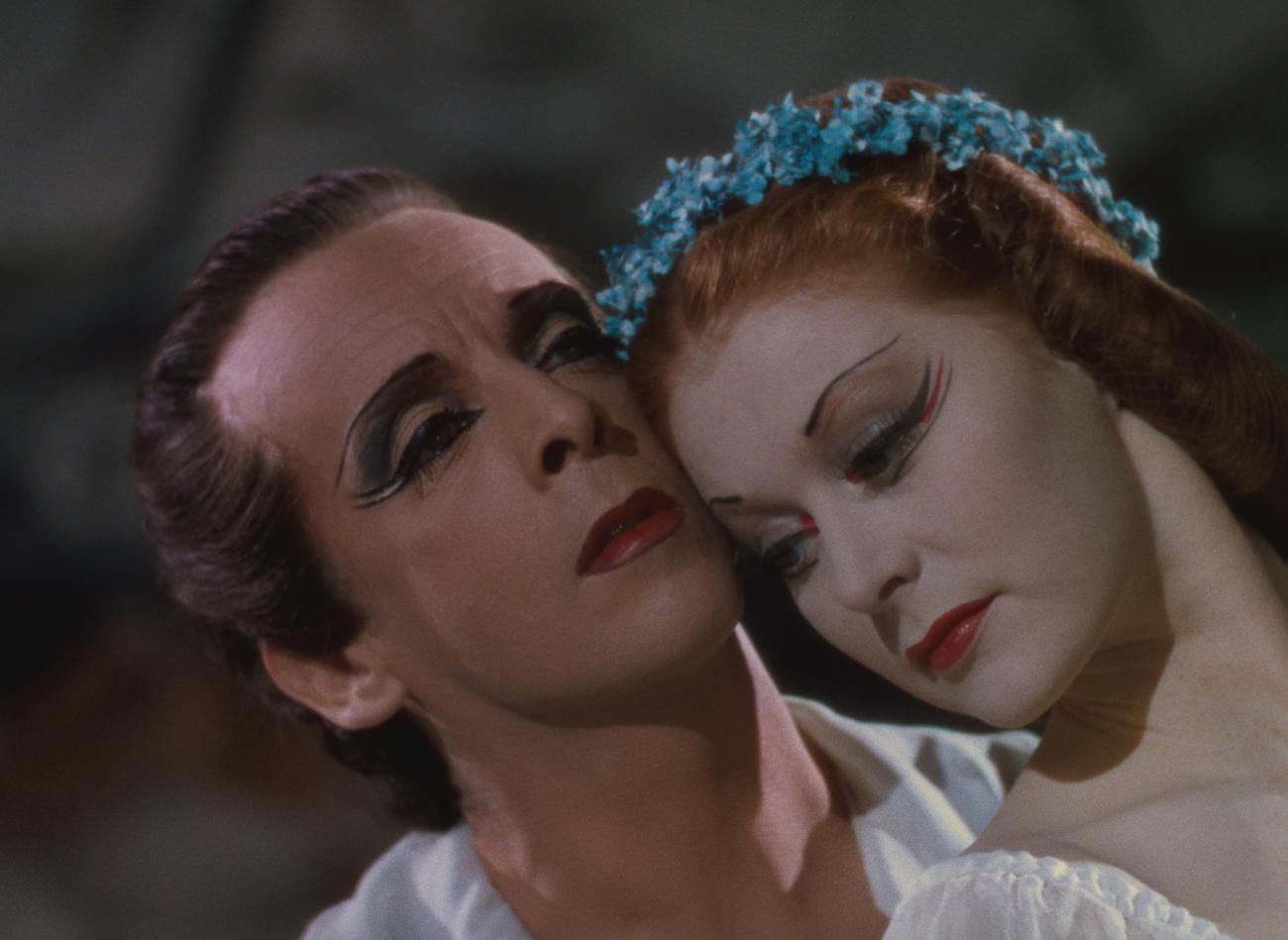
Image context: the cover still comes from BFI materials for The Red Shoes and shows a moment from the ballet sequence rather than a neutral portrait of the performers.[1][3] That choice fits the argument because British Technicolor is at its strongest when faces, greasepaint, costume, and lighting stop behaving like background decoration and start carrying drama directly.
Color had to justify its own cost, so it became structure
The industrial facts matter because they shaped the style.[1][2] Technicolor arrived in Britain through leased three-strip cameras and imported systems of supervision, and even after a British laboratory opened in 1937 the process remained costly enough that each production needed a reason to use it.[1] Black-and-white was still the default language of screen seriousness, so color could not merely announce itself as novelty forever. It had to make an argument for why a particular film needed this heavier machinery. British filmmakers answered by making color do conceptual work.
Street's account of the "British School of Technicolor" helps define the answer.[1] The palette could be softer than Hollywood's, partly because of local taste, light levels, and laboratory conditions, but softness did not mean passivity. It meant pressure organized differently. A red accent, a painted wall, a glow on skin, or a controlled transition between warm and cold tones could carry symbolic weight without tipping into pure display.[1][2] When Sam Wigley writes that the first great British color films showed not the world exactly as anyone sees it but the world with a fresh lick of paint, he is pointing toward the essential logic of the movement.[2] British Technicolor did not become important by disappearing into realism. It became important by quietly making realism insufficient.
This is also why the movement belongs inside movie history rather than beside it as a technical sidebar.[1][2] The collaboration color demanded changed genre from within. Melodrama, wartime fantasy, imperial crisis stories, ballet films, and literary adaptations all discovered that emotional emphasis could be redistributed away from dialogue alone and into coordinated surfaces. A room could become accusatory before anyone spoke. A costume could announce imbalance before the plot admitted it. A sky, a veil, a lipstick trace, or a stage backdrop could tip a scene from description into psychic weather.
The Red Shoes turns ballet cinema into a composed film
The cleanest single demonstration is The Red Shoes.[3] BFI's film page describes Powell and Pressburger's 1948 masterpiece as a triumphant attempt to create a "composed film" in which Brian Easdale's music takes on central authority and demands similar expressive intensity from every detail of design and performance.[3] That phrase matters because it tells you how British Technicolor exceeds a simple question of beauty. The movie is not colored after the fact. It is composed through color, music, décor, and movement at the same time.
Seen in that light, the celebrated ballet sequence is not just a filmed stage number.[3] It is a declaration that dance on screen can break away from theatrical recording and enter a more synthetic cinema where painted faces, impossible transitions, stylized sets, and the pressure of red itself all help narrate what ambition feels like. The BFI page argues that the film has inspired both dancers and filmmakers; the reason is formal as much as thematic.[3] It lets performance generate its own world, then lets color keep that world coherent even as it grows stranger.
TCM's production history helps explain why this felt like more than a handsome prestige picture.[5] Paul Tatara describes The Red Shoes as a risky undertaking precisely because Powell and Pressburger were betting that a lengthy ballet passage, running without dialogue, could serve as the narrative's final movement on screen.[5] That gamble belongs to British Technicolor's broader achievement. Once color, performance, and music are trusted to carry dramatic weight directly, the movie no longer treats the ballet as an interlude. It becomes the place where cinema proves it can turn theatrical material into a synthetic visual event of its own.
Black Narcissus proves that fabricated color can feel more psychologically exact than location realism
If The Red Shoes shows British Technicolor turning performance into total design, Black Narcissus shows the same tradition making artificiality feel spiritually exact.[2][4] BFI's film page notes the essential paradox outright: despite the film's lush Himalayan location, it was shot at Pinewood, with exterior scenes made in a garden in Horsham, and yet Jack Cardiff's cinematography and Alfred Junge's sets remain the source of its unforgettable atmosphere.[4] This is not a failure of authenticity. It is the point. The film's crisis is inward, erotic, colonial, and unstable; a more literal landscape would have given it less room to hallucinate.
British Technicolor is especially powerful in such cases because it treats the studio not as a compromise, but as a precision instrument.[2][4] The convent in Black Narcissus does not need to persuade us that we are visiting a documentary Himalayas. It needs to persuade us that altitude, desire, repression, and imperial fantasy have all begun to leak into one another. Color and design make that leakage visible. The famous lipstick shock lands not only because Kathleen Byron's performance is ferocious, but because the film has already trained the eye to treat chromatic intensity as moral weather.[4]
This is where British Technicolor parts company with any merely tasteful reputation.[1][2][4] The surfaces are controlled, yes, but control is what allows delirium to register cleanly. A supposedly softer national style becomes the vehicle for some of cinema's most pressurized emotions. That paradox runs through the movement: the image is carefully made so that feeling can look as though it is escaping the frame.
Why the movement still matters
The value of British Technicolor lies in that conversion of craft into dramatic necessity.[1][2][3][4][5] Its films were expensive, collaborative, and often technically difficult. Instead of hiding those conditions, the best of them transformed the burden into method. They made color justify its existence by giving it jobs usually reserved for plot, dialogue, or performance alone. It could define emotional hierarchy, intensify fantasy, expose repression, or turn studio fabrication into a higher form of truth.
That is why the movement remains more than a heritage label.[1][2] It names a period in which British cinema discovered that color could be neither mere realism nor mere ornament, but a full structural force. The Red Shoes makes art look fatal because every surface agrees to the obsession and because the film is willing to let performance itself become the narrative's climax.[3][5] Black Narcissus makes spiritual collapse look inescapable because the world itself appears painted into tension.[4] In both cases, color is not the icing on the cake. It is the pressure inside the batter. British Technicolor stopped looking tasteful at the precise moment it learned how to make feeling visible.
Sources
- Sarah Street, "10 great British Technicolor films," BFI.
- Sam Wigley, "A glorious adventure: colour films in Britain," BFI.
- BFI, "The Red Shoes (1948)" film page.
- BFI, "Black Narcissus (1947)" film page.
- Paul Tatara, "The Red Shoes," TCM.