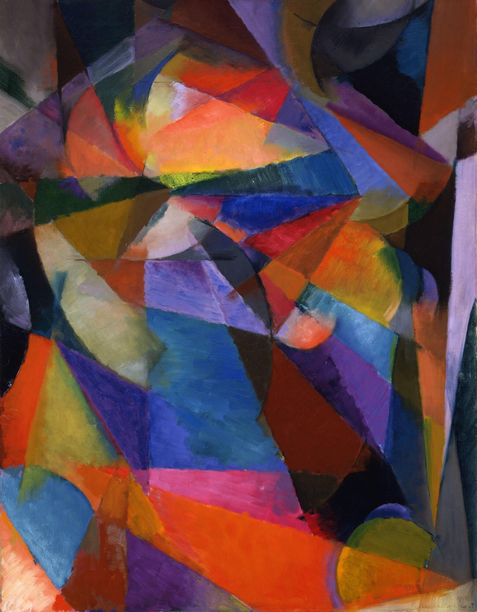
Image context: this post uses a real museum reproduction of Stanton Macdonald-Wright's 1916 Synchromy, Blue-Green from the Toledo Museum of Art image service, not a generated abstraction, diagram, chart, or decorative placeholder. The image is the evidence: the article depends on seeing color work as mass, pressure, depth, and rhythm rather than as a surface effect added after drawing.[1]
Synchromism is easy to file under "color music" and then leave there. The name encourages it. Stanton Macdonald-Wright and Morgan Russell wanted the word "Synchromy" to carry the echo of "symphony," and the Smithsonian American Art Museum notes that their system treated colors almost like scales and harmonies arranged by a musician.[2] But the musical metaphor can become too soft if it turns the paintings into mood pieces. The sharper claim is structural: Synchromism tried to make color do the job that line, modeling, and subject matter had usually done.
That is why the movement still deserves attention despite its short public peak. Around 1912 and 1913, two American artists working through Parisian modernism made a claim that was both ambitious and unstable: color could generate form, carry emotion, imply movement, and compete with Cubism and Futurism without simply borrowing their machinery.[2][5][6] The paintings can look like whirling abstraction from across a room. Up close, they are arguments about where pictorial structure comes from.
Color Was The Architecture
The Toledo Museum's Synchromy, Blue-Green is a useful anchor because it makes the method legible without needing a manifesto in hand. The 1916 painting's image record gives us a compact view of the problem: no stable narrative scene, no conventional contour doing the main work, just a dense chromatic field that has to organize itself through relation.[1] Read beside the Smithsonian's account of Macdonald-Wright and Russell trying to make color create form, the painting becomes less like a decorative abstraction and more like a stress test for color as structure.[2]
The composition gathers cool blue and green planes around a warmer orange-red focal pressure. The warm area does not merely sit on top of the cool field. It pushes forward, pulls the surrounding colors into relation, and gives the picture a center that feels less like a depicted object than like a crescendo. The important thing is that none of those effects require a conventional contour to do the organizing.[1][2]
This is the movement's central move. Color stops filling a pre-existing body and starts behaving like the body. The blues and greens are not atmosphere around a subject. They are weight, recession, and interval. The orange-red is not highlight. It is force. Once that switch is visible, Synchromism stops looking like a decorative branch of early abstraction and starts looking like an engineering problem: how can a canvas hold together if hue has to carry load?
Paris, But Not Just Paris
Synchromism was born in the same charged field that produced Cubism, Orphism, Futurism, and a wider search for non-naturalistic form. The Smithsonian account gives the essential sequence: Macdonald-Wright met Russell in 1911, the two shared an interest in paintings where color created form, and both studied with Ernest Percyval Tudor-Hart, whose color theory connected color and music.[2] The Vilcek Foundation similarly frames the movement as founded by Russell and Macdonald-Wright in 1912, with first exhibitions in Munich and Paris the following year.[6]
Those dates matter because they keep Synchromism from becoming a late American echo of European abstraction. It was entangled with Paris, but it was not simply provincial catch-up. Macdonald-Wright and Russell were expatriate Americans trying to enter the most competitive modernist conversation available, and they did it by making color the principle rather than the accessory.
The pressure of neighboring movements is still visible. The National Humanities Center's teaching packet on Macdonald-Wright's 1920 Aeroplane Synchromy in Yellow-Orange identifies it as a Metropolitan Museum of Art painting and frames it as an abstract Synchromist response to the airplane, with color, Cubist influence, flight, rooftops, propeller motion, and immediacy held together.[5] That later work is important because it shows Synchromism was not only a pursuit of pure inward harmony. It could absorb the machine age and still translate it through chromatic motion.
The Figure Did Not Disappear Cleanly
One reason Synchromism is more interesting than a simple abstraction story is that representation keeps returning under pressure. Whitney's page for Macdonald-Wright's 1918 Oriental - Synchromy in Blue-Green explains that he made some fully abstract works, but by 1916 had begun using a color-infused figuration.[3] Buffalo AKG's page for Russell's Synchromy in Orange: To Form makes a parallel point: although the painting appears abstract, preparatory studies show that Russell related its configuration to the human figure and to Cubist treatment of objects.[4]
That is not a weakness. It is the movement's unresolved intelligence. Macdonald-Wright and Russell were not always trying to erase the world. They were trying to rebuild the relation between world and form. A body, a city, an airplane, or a figure could remain present, but it had to pass through color before it became pictorially convincing.
This gives Synchromism a productive tension. If the image becomes too representational, color risks returning to decoration. If the image becomes too purely abstract, the musical metaphor risks floating free of contact. The strongest Synchromist works live between those poles. They let color carry enough structure that figure and space feel generated from within the chromatic system, not imposed on it afterward.[1][3][4]
Scale Was Part Of The Claim
Russell's Synchromy in Orange: To Form shows why the movement wanted more than small optical experiments. Buffalo AKG calls the work a pinnacle of Synchromism and emphasizes both its complex composition and impressive scale.[4] Scale matters because color-as-structure has to convince the whole body, not only the eye. A small study can demonstrate a relation; a large canvas makes that relation spatial.
Synchromism's language often leans toward harmony, but the paintings are not always harmonious in a gentle sense. They can be crowded, heated, almost overbuilt. That density is part of their modernity. Color chords are not a retreat from modern life; they are a way to make modern life legible after traditional modeling has lost authority. The National Humanities Center's reading of Aeroplane Synchromy is especially clear on this point. The work turns flight into blur, propeller motion, close-range speed, and chromatic rotation rather than a clean machine portrait.[5]
In that sense, Synchromism shares more with engineering and choreography than with mere lyricism. It asks the viewer to feel color as a sequence of pressures. Warm advances, cool recedes, planes lock and unlock, and the eye moves through the canvas as if navigating a built environment. The painting does not illustrate motion. It stages the conditions under which motion can be felt.
A Movement With A Short Fuse
The pure Synchromist moment was brief, and that brevity is part of the story. The Vilcek Foundation's object page points back to the first Munich and Paris exhibitions in 1913 and later exhibition histories that helped reconstruct the movement's importance.[6] The Smithsonian blog also notes that Macdonald-Wright and Russell diverged from the style even as Macdonald-Wright continued to think about color, light, and time through his later Synchrome Kineidoscope.[2]
That afterlife matters because Synchromism was never only a set of canvases. It was a theory of perception that kept looking for better machinery. The Kineidoscope, first imagined in 1913 and developed much later, extended the old question into projected color and duration: how might a painting change through time?[2] The machine was not the movement's main achievement, but it exposes the logic already present in the paintings. Color was not static fill. It was event, sequence, and structure.
The movement's reputation also suffered from proximity. Cubism had the stronger historical brand. Futurism had the louder rhetoric. Orphism had Delaunay's color authority. Synchromism looked adjacent to all three and was easy to reduce to derivative color abstraction. That reduction misses the American wager inside it: two artists tried to claim that a modern painting could be built from chromatic energy as seriously as from fractured objects or mechanical speed.
Why It Still Looks Unsettled
The best Synchromist paintings are not entirely comfortable. They do not offer the clean confidence of later hard-edge abstraction or the all-over certainty of mature nonobjective painting. Their forms swell, rotate, compress, and sometimes half-reveal figures beneath the color. That instability is the point. Synchromism belongs to a moment when abstraction was not yet a settled language. It was still a contested procedure.
That makes Synchromy, Blue-Green feel more alive than a neat historical label. The painting is not simply blue and green with a warm accent. It is a test of whether hue can organize attention, whether warmth can behave like a spatial thrust, whether coolness can hold depth, and whether a picture can be emotional without leaning on anecdote.[1][2] Its musical analogy matters, but the canvas is not trying to become music. It is trying to make painting ask music's question: can relation itself become form?
Synchromism's achievement is smaller than its ambition, but the ambition remains useful. It pushed early American modernism toward a difficult idea: color is not a finish laid over structure. Color can be the structure. Once that claim is taken seriously, the paintings stop sounding like symphonies in the abstract and start looking like pressure systems built from hue.
Sources
- Toledo Museum of Art, IIIF image for Stanton Macdonald-Wright's Synchromy, Blue-Green (1916) - official museum reproduction used as the article's cover image.
- Smithsonian American Art Museum, "Q and Art: Stanton Macdonald-Wright and his Kinetic Art Machine" - museum blog on Macdonald-Wright, Morgan Russell, Tudor-Hart, Synchromism, color/music theory, and the Synchrome Kineidoscope.
- Whitney Museum of American Art, "Stanton Macdonald-Wright, Oriental - Synchromy in Blue-Green" - collection page on the 1918 painting, the term Synchromy, music analogy, abstraction, and color-infused figuration.
- Buffalo AKG Art Museum, "Morgan Russell, Synchromy in Orange: To Form" - object page on Russell, Macdonald-Wright, Synchromism, color theory, preparatory studies, human figure structure, and Cubist context.
- National Humanities Center, "The Aeroplane in Visual Art of the 1920s" - teaching PDF identifying Macdonald-Wright's 1920 Aeroplane Synchromy in Yellow-Orange at the Metropolitan Museum of Art and discussing Synchromism, color/music theory, Cubist influence, flight, rooftops, propeller motion, and immediacy.
- Vilcek Foundation, "Morgan Russell, A Synchromy" - object page and movement context on Synchromism's founding, 1913 Munich and Paris exhibitions, later exhibition history, and color as an independent formal element.