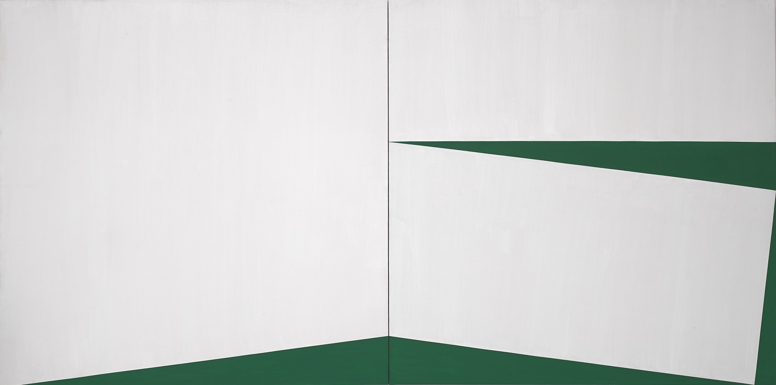
Image context: this post uses a real museum reproduction of Carmen Herrera's 1960 Blanco y Verde from the Smithsonian American Art Museum, not a diagram, generated image, or abstract placeholder. The painting itself is the visual evidence: the argument depends on the way green, white, canvas edge, and central join behave under pressure.[1]
Carmen Herrera's Blanco y Verde looks severe at first, almost withholding. A white field, a hard green intervention, a vertical meeting line between two canvases: it seems to offer very little to hold onto. That first impression is part of the work's trap. Herrera does not make spareness feel empty. She makes it feel loaded. The painting's drama comes from how few elements are allowed in, and how much work each one is forced to do.[1]
The Smithsonian's 1960 diptych is not a picture of a green shape on a white background. It is a structure in which the physical edge of the canvas has become a participant in the image. SAAM describes the Blanco y Verde series through two colors, sharp triangular forms, and the way the canvas edges define sides of the triangles.[1] Once that is visible, the painting stops reading as decorative geometry. It becomes a disciplined argument about where form begins: not at the center of the picture, but at the boundary.
The Seam Is Not Neutral
The most important line in the painting may be the vertical join. It is easy to mistake it for a practical division, the place where one canvas ends and the other begins. But Herrera's painting makes practicality visible. The seam is the place where the white field becomes unstable, where two panels press together, and where the green areas start to feel less like painted additions than like cuts made through a larger plane.
Whitney curator Dana Miller's audio on a 1959 Blanco y Verde clarifies the larger logic of the series. She notes that the painting is made from two canvases and that the canvas structure, the green shape, the line, and the triangle work together to create the total image.[2] That observation helps with the Smithsonian work too. Herrera is not hiding the support under illusion. She is recruiting it. The canvas is not a passive surface waiting for composition; it is part of the composition's machinery.
This is why the seam feels tense rather than merely symmetrical. It gives the eye a measuring device, then makes the measurements feel unequal. White occupies most of the picture, but it does not win by quantity. Green arrives as a wedge, a side pressure, a force that enters from the margins and changes the whole field. The painting asks the viewer to feel how a line can govern more space than it visibly covers.
Green Behaves Like A Cut
The green in Blanco y Verde is dense and flat, but its job is not just color contrast. It behaves like a cut into white. Whitney's transcript makes this especially clear when Miller describes Herrera's paintings as often thinking in three-dimensional terms, with the green working almost like negative space sliced into a white plane.[2] That is the key to the work's strange energy. The green does not sit politely inside the rectangle. It seems to expose the rectangle's hidden stress.
Herrera's restriction to green and white makes that effect sharper. If the painting had five colors, the eye might begin sorting hierarchy, balance, warmth, and rhythm in a more conventional way. With two colors, the relation becomes more absolute. Whitney's Lines of Sight page records Herrera's own attachment to the Blanco y Verde series and notes that nine paintings from 1959 to 1971 showed her using the physical structure of the canvas as a compositional tool.[3] That long return matters. Green and white were not a one-off palette trick. They were a laboratory.
The palette also refuses easy symbolism. Green can carry nature, freshness, permission, jealousy, money, or national memory if a viewer insists on attaching meanings to it. Herrera's painting does not forbid those associations, but it does not need them. Its first meaning is spatial. Green says: here is a pressure, here is an edge, here is the point where white is no longer empty but shaped by what cuts into it.
Architecture Without A Building
Herrera's architecture training is not background trivia. It changes the way the painting should be read. Whitney's account of her life places her early study of architecture in Havana before her move to New York, Paris, and back to New York; the Smithsonian obituary also stresses that she studied architecture in Cuba before shifting toward painting.[3][4] The point is not that Blanco y Verde resembles a building. It is that the painting thinks architecturally.
Architecture teaches that space is made by boundaries, openings, load, interval, and passage. Herrera transfers that intelligence to the canvas without illustrating a room. The white areas feel planar, not atmospheric. The green edges behave like structural decisions. The central join acts less like a painted line than like a hinge. The picture is frontal, but it keeps hinting at thickness, as if the rectangle had been folded, sliced, or brought to the edge of relief.
That is why the painting can feel calm and aggressive at the same time. Nothing drips, breaks, or gesticulates. There is no visible hand drama. Yet the green forms have the decisiveness of a door cut, a wall angle, or a floor plane seen from an impossible position. Herrera's severity is not coldness. It is compression. She removes nearly everything that could distract from the encounter between edge and force.
Late Recognition Should Not Soften The Looking
Herrera's biography is often told as a delayed-recognition story, and for good reason. SAAM notes that she faced hurdles as a woman and Cuban immigrant, gained public acclaim only after decades of highly refined work, and continued working near the end of a life that reached 106.[1] The Whitney exhibition page similarly describes the discrimination she faced after returning to New York in 1954, when Abstract Expressionism dominated and her hard-edged abstraction found little welcome.[3] Those facts matter, but they can accidentally sentimentalize the work if they become the whole frame.
Blanco y Verde does not ask to be admired because Herrera was overlooked. It asks to be handled as a tough visual object. The late acclaim sharpens the historical injustice, but the painting's authority lies in the decisions on the canvas. If anything, the story of delay makes the work look less gentle. The canvas had already solved a problem that the art world was slow to recognize: how to make austerity active, how to let a straight line carry motion, and how to make a painting operate almost like a built thing without surrendering its flatness.[1][2][3]
The best answer to delayed recognition is therefore not pity. It is attention. Look at how the green touches the edge. Look at how the white field is never merely blank. Look at how the join keeps the image from dissolving into design. Herrera's painting has survived the biography because it gives the eye a precise task.
From Canvas Edge To Public Space
The later Estructuras make visible what Blanco y Verde already implies. Parrish Art Museum's account of Carmen Herrera: Estructuras Monumentales explains that Herrera's large-scale aluminum works grew from sketches and paintings first imagined in the 1960s, and that they play on positive and negative space, wedge-shaped cutouts, monochrome forms, and the surrounding environment.[5] That description sounds like sculpture, but it also sounds like Blanco y Verde translated outward.
The connection should not be overstated. A diptych on a wall and a large outdoor structure make different demands on the body. But the underlying grammar is consistent. In both, Herrera treats color as a spatial event rather than a skin. She treats absence as shaped rather than empty. She treats the edge not as a frame around the work but as a live condition inside it.[2][5]
Seen this way, the 1960 Blanco y Verde is not a minor exercise in reduction. It is a pressure chamber. Its two colors are enough because the problem is exact: how little can a painting contain while still making space feel cut, loaded, and newly articulate? Herrera's answer is severe, but not silent. A green line enters the white field, finds the edge, meets the seam, and makes the whole rectangle start thinking.
Sources
- Smithsonian American Art Museum, "Carmen Herrera, Blanco y Verde" - object page for the 1960 diptych, including image source, dimensions, artwork description, edge logic, and recognition context.
- Whitney Museum of American Art, "Carmen Herrera, Blanco y Verde" - collection page and audio transcript on the 1959 work, two-canvas structure, green as negative space, and the series' triangle logic.
- Whitney Museum of American Art, "Carmen Herrera: Lines of Sight" - exhibition archive covering the 1948-1978 focus, the nine Blanco y Verde paintings, Herrera's architecture background, and delayed recognition.
- Smithsonian American Art Museum, "Remembering Carmen Herrera" - 2022 career overview on Herrera's Havana architecture study, Paris period, late recognition, and SAAM's Blanco y Verde.
- Parrish Art Museum, "Carmen Herrera: Estructuras Monumentales" - exhibition page on Herrera's large-scale Estructuras, positive and negative space, wedge-shaped cutouts, and surrounding environment.