Pastel often gets described as a halfway point between drawing and painting, which is true only if the phrase is allowed to stay vague.[1][3] Its real distinctiveness is more exact. Pastel keeps pigment unusually close to the surface. Instead of suspending color in oil, binding it into wet plaster, or sinking it into an etched plate, the artist drags compressed powder across a sheet with enough tooth to catch and hold it.[1] That material fact explains two things at once: why pastel can look startlingly bright, and why it is permanently at risk.
The brightness comes first. The Metropolitan Museum notes that pastel is made from finely ground pigments, a white filler such as calcium carbonate or kaolin, and only a minuscule amount of binder, usually gum tragacanth.[1] Because there are no yellowing resins in the mixture and because light reflects off countless facets of powder near the surface, pastel keeps a high optical vibrancy.[1] The cost is equally built in. If the medium's attraction lies in color remaining powdery and exposed, then every later attempt to lock it down carries danger. Fixatives can darken it, vibrations can shake particles loose, and strong light can injure fugitive colors.[1][6]
That is why pastel feels physically different from other colored media. It does not ask the viewer to look through a layer toward an illusion behind it. It asks the viewer to remain aware of a dustlike deposit that has only just become image. Pastel can be painterly, blended, or delicate, but even at its richest it preserves a sense that the picture sits on the support rather than inside it.[1][4]
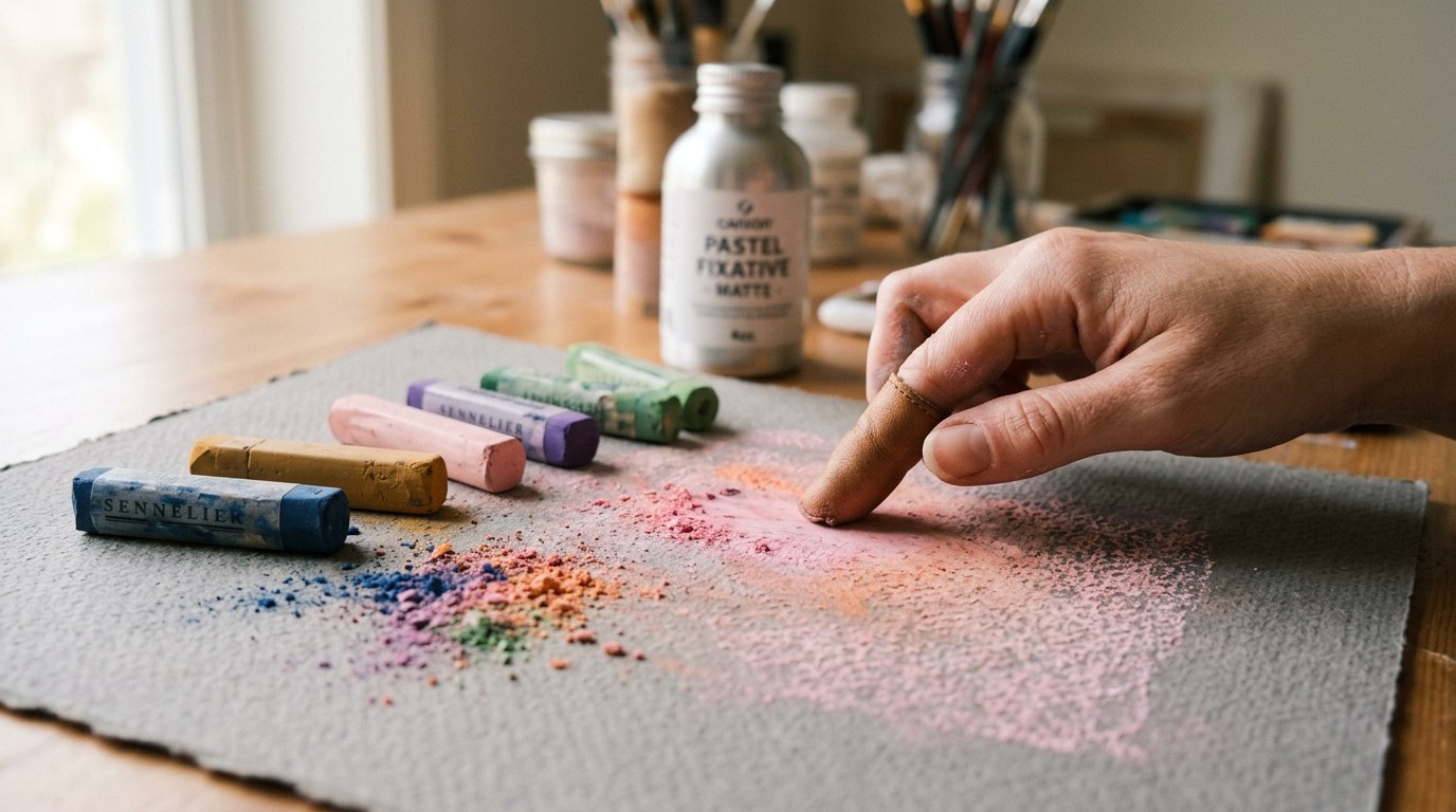
Image context: the cover stays close to the workbench because the article's claim begins before any finished museum object appears. Pastel's drama is already present in the powder, the tooth of the paper, the hand pressure, and the fixative bottle waiting nearby: color has arrived at the surface, and the surface has not stopped being physically exposed.
Powder needs a surface that can resist and receive it
The medium begins with friction. The Met's overview says pastel normally requires paper with a slight texture, or tooth, so the particles can grip instead of sliding away.[1] That tooth matters because it turns support into an active partner. A smooth surface would let the color skid; a properly textured one catches the powder while still leaving it exposed to view.[1][4] Pastel therefore depends on a support that both receives and resists the stroke.
This is one reason the medium encourages artists to think in terms of contact rather than penetration. The broad side of a stick can leave a light veil that reveals the paper texture underneath, while the tip can build sharper, more saturated marks.[1] The same source notes that pastel can be spread with a finger, a stump, sponge, or brush, and even mixed with water for more opaque accents.[1] Yet the richest chromatic effects usually come from letting individual strokes remain distinct instead of smearing everything into one blended fog.[1]
That distinction matters historically as well as visually. The Getty's exhibition on the birth of pastel places the medium's rise in the eighteenth century, when artists saw in it a serious alternative to oil painting, especially for portraiture.[3] The National Gallery states the same point more compactly: pastel was particularly popular for portraits in the eighteenth century because it took less time than oil.[2] Speed, then, is part of the medium's history. Pastel can move quickly, but quickness does not make it casual. It makes the stroke more decisive because there is less material depth in which to hide it.
Pastel rewards separate strokes more than deep mixtures
Pastel becomes strongest when artists trust the surface instead of over-correcting it. The Met's materials essay explains that excessive blending diminishes brilliance, while separate marks of individual colors create stronger tonal and chromatic relations.[1] That is the medium's core paradox. It looks soft, but softness is not its deepest strength. Its deeper strength lies in how it can hold separate decisions close together without fully dissolving them.
The medium also spans a wide range of artistic temperatures. The same Met text points from Jacopo Bassano's sixteenth-century preparatory study to Odilon Redon's animated surfaces and Maurice Quentin de La Tour's physically stabilized layers, showing that pastel can function as swift notation, finished portraiture, or highly elaborate color construction.[1] The National Gallery's short glossary identifies La Tour and Degas as exemplary masters of the form.[2] That pairing is useful because it links two different achievements: eighteenth-century control and nineteenth-century pressure.
The National Gallery of Art's Touch of Color exhibition page helps widen the frame. It describes pastel as an almost endlessly adaptable medium that can be used wet or dry, directly from the stick or ground to powder and brushed on, and it traces the form from the Renaissance to the twenty-first century.[4] Pastel, in other words, is not a niche branch of draftsmanship. It is a long-running technical system with unusual optical rewards and equally unusual conservation problems.[4]
Degas shows how pastel can become muscular without ceasing to be fragile
Edgar Degas is the strongest test case because he pushed pastel far beyond genteel portrait finish. The Met's object page for Woman Having Her Hair Combed identifies the work as a large pastel on light green wove paper, now discolored to warm gray, affixed to its original pulpboard mount.[5] The page also notes that Degas intended it for the 1886 Impressionist exhibition group devoted to women bathing, washing, drying, and combing their hair, and it stresses the work's meticulous finish and opalescent skin set against acidic decor.[5] This is pastel at full scale and full ambition.
The conservation essay on the same work explains why it remains such a useful case.[6] Degas built the image through vivid complementary hues in overlapping vertical strokes, taking advantage of new synthetic colorants while also inheriting their vulnerability.[6] The crimson family and the dyed paper itself are sensitive enough that the museum must keep the work under subdued illumination, stable humidity, and tightly controlled temperature.[6] Vibrations are dangerous because the powder can shift. Ordinary fixative is dangerous because it can darken the colors and damage pastel's high-key brightness.[6]
That last point goes to the heart of the medium. Pastel's beauty and its conservation challenge are the same fact viewed from two angles. The powder lies near the surface, so color appears brilliant. The powder lies near the surface, so the work must be protected from touch, motion, and overzealous stabilization.[1][6] There is no clean separation between visual effect and material risk.
Why pastel still feels immediate
Pastel endures because it refuses to let color become comfortably abstracted from matter. Ground pigment, slight binder, textured paper, separate strokes, and the constant question of how much to blend or secure: all of these remain legible in the final image.[1][2][4] The medium can be tender, grand, rapid, monumental, or intimate, yet it almost always keeps some record of how color arrived and how easily it could still be disturbed.
That is why pastel can feel more direct than more durable media. Oil often asks for time before it settles into surface. Fresco asks for architecture and chemistry. Pastel asks for powder, tooth, and nerve. It brings color close to the eye by keeping it close to the paper. The same proximity that makes it radiant also keeps it vulnerable, and that vulnerability is not an unfortunate side effect. It is part of what the viewer is seeing.
Sources
- The Metropolitan Museum of Art, "Pastel" - materials-and-techniques overview on pastel's powdered composition, paper tooth, optical brightness, separate-stroke color logic, and the darkening risk of fixative.
- The National Gallery, London, "Pastel" - glossary entry on pastel as a gum-bound stick medium, its eighteenth-century popularity for portraits, and the distinction between soft and hard pastel.
- The Getty Museum, "The Birth of Pastel" - exhibition page on the medium's emergence from colored chalk drawing and its eighteenth-century rise as a fast, refined alternative to oil painting.
- National Gallery of Art, "The Touch of Color: Pastels at the National Gallery of Art" - exhibition overview describing pastel's adaptability across wet and dry handling, direct stick work, powdered application, and long technical history.
- The Metropolitan Museum of Art, "Woman Having Her Hair Combed" - object page with date, medium, mount, exhibition context, and discussion of Degas's layered color contrasts in the finished pastel.
- The Metropolitan Museum of Art, "Precious Powder: The Fragility of Degas's Pastels" - conservation essay on overlapping strokes, fugitive colorants, subdued lighting, vibration risk, and the limits of fixative in preserving pastel.