Most print media begin by asking where the line goes. Mezzotint begins with a stranger proposition: what if the plate already contains night. In the classic process, the copper is roughened all over so that, if printed untouched, it would yield a dense black field; only after that dark ground exists does the printmaker scrape and burnish light back into the image.[1][2] That reversal is why mezzotint still feels physically different from engraving, etching, or woodcut. The image does not assemble itself out of drawn contour first. It emerges by degrees out of shadow.
That is the useful way to approach the medium now. Mezzotint matters not only because it was historically popular, nor only because it reproduced paintings for a broad market. It matters because its technical sequence changes what the eye expects from a print. Instead of crisp line carrying the argument and tone arriving afterward as support, tone is the argument from the start.[1][2] The medium is built for half-light, for velvet darks, for forms that appear to breathe out of the page rather than sit sharply on top of it.
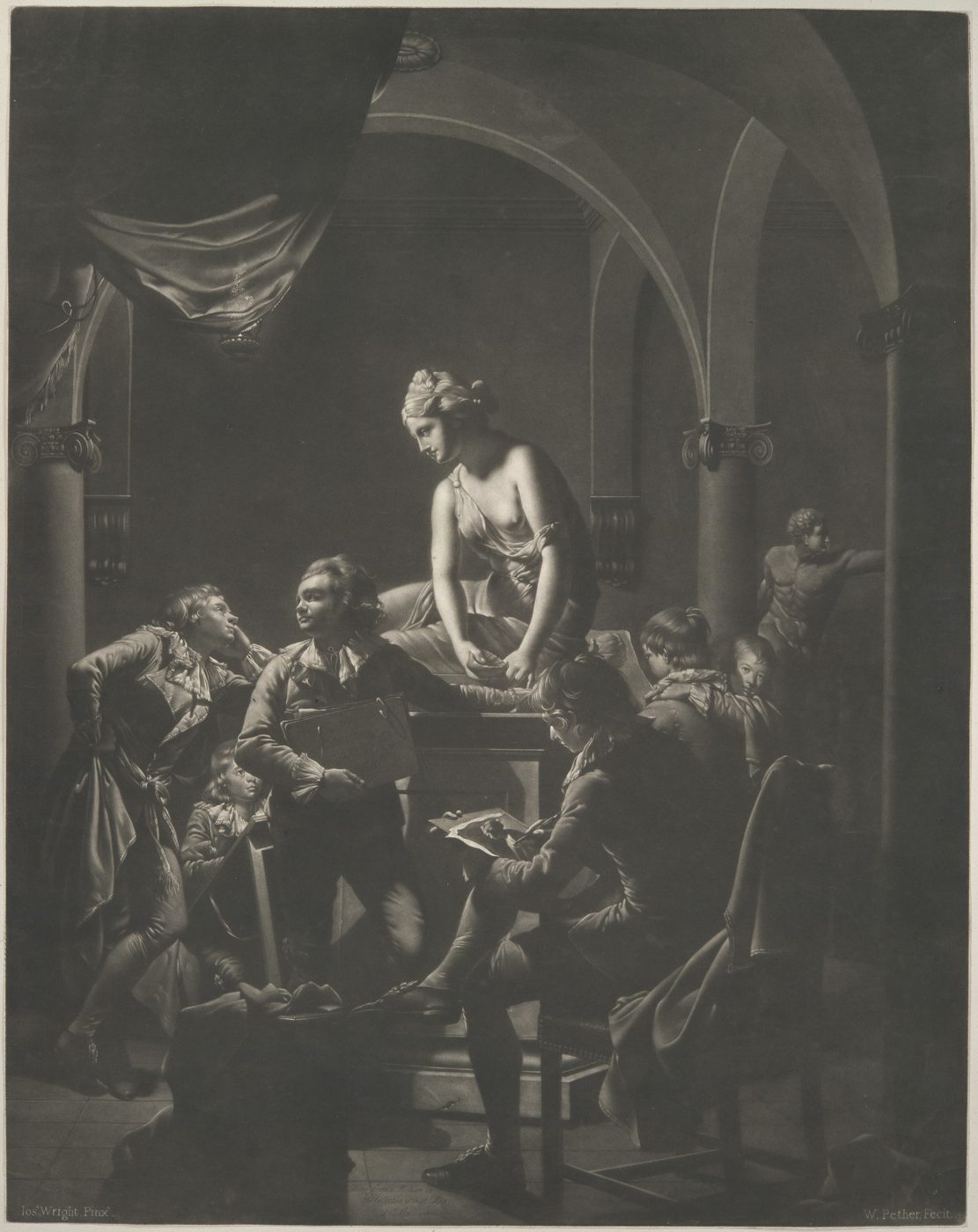
Image context: the cover reproduces William Pether's An Academy by Lamplight from the Metropolitan Museum of Art. It matches the article exactly because the essay turns on mezzotint's ability to hold a room together through dark mass and then let the lamp, paper, and chipped stone emerge from within that darkness rather than from a net of explicit outlines.[3]
1) The plate is prepared as black before it is made legible
The most important fact about mezzotint is also the easiest to flatten into a technical footnote. The Metropolitan Museum's history of the medium defines mezzotint through halftones and explains that the plate is first worked so it would print "one even black" before the artist introduces light by smoothing selected areas.[1] The V&A's printmaking guide says the same thing in plainer workshop language: the metal plate is systematically pitted with a rocker so it will print a deep even black, then scraper and burnisher are used to polish passages lighter.[2]
That sequence changes the emotional logic of the medium. In engraving, the hand cuts clarity into metal. In etching, acid bites a design that has already been drawn through a ground. In mezzotint, the image arrives by subtraction from darkness.[1][2] The printmaker is constantly deciding how much grain to leave in place, how much to soften, and how far to push a highlight before it loses relation to the surrounding field. Light is not simply added information. It is a calibrated thinning of black.
This is one reason mezzotint rarely feels fully graphic in the poster-like sense. Its best effects depend on tonal pressure rather than on strong declarative edge. Surfaces turn atmospheric, and contours often seem to gather themselves gradually instead of snapping into place. The eye reads the medium through approach and recession.
2) Tone becomes structure, not decoration
Once the dark-ground logic is clear, many of mezzotint's historical affinities stop looking accidental. The Met notes that the medium presents subtle gradations of light and shade rather than depending mainly on line.[1] That is why it proved so effective with candlelight scenes, fabric, flesh, weather, smoke, and nocturnal interiors. The medium can keep forms soft at the boundary while still making the brightest touches feel acute.
Pether's An Academy by Lamplight is a near-perfect demonstration.[3] The Metropolitan Museum's object note describes the print as an exquisite mezzotint with subtle tonal range, deep shadows warmed by brownish ink, and highlights that seem almost to glow against velvety darks.[3] That is not incidental description. It names the medium's specific competency. Mezzotint does not merely record that a lamp is present. It makes the lamp's field of command visible. Paper, plaster, bare skin, and stone plinth become readable because darkness has been left dense enough around them.
The same logic explains why eighteenth-century viewers often found mezzotint especially persuasive with dramatic light effects. The British Museum's note on Pether's An alchymist, after another Joseph Wright composition, says Wright's paintings were studies of the effect of light and that mezzotint was the perfect medium for reproducing his work.[4] The phrase matters because it clarifies what reproduction meant here. The engraver was not simply translating a composition into cheaper black and white. He was choosing a process whose tonal behavior could carry the original painting's strongest atmospheric claim.
3) The medium became a circulation machine because it could carry mood quickly
Mezzotint's market history follows directly from that tonal power. The Met's overview explains that, because a mezzotint could be produced more rapidly and less expensively than a line engraving, it became a favored means for the quick dissemination of timely images.[1] In Britain especially, painters and mezzotinters worked in close relation, and reproductions circulated widely enough to be shown beside the painted originals in annual exhibitions.[1] The medium also fit domestic life neatly: standard sizes, standard frames, and a broad appetite for portraits, genre scenes, historical subjects, and so-called furniture prints.[1]
That history is important because it complicates the easy hierarchy in which painting is singular and serious while reproductive print is derivative. Mezzotint thrived precisely because it could move pictorial atmosphere through the market without stripping it down to bare outline. If a portrait needed soft flesh, a moral scene needed theatrical spotlight, or a Wright interior needed the drama of controlled illumination, mezzotint could deliver enough tonal richness to keep the image socially potent at scale.[1][3][4]
This makes the medium one of the clearest examples of how technique shapes public visibility. A culture that wants images to travel has to decide what can survive the trip. Mezzotint answered that problem by making gradation itself portable.
4) The best mezzotints do not hide their status as translations
There is still a temptation to praise mezzotint only when it seems almost painterly, as though the highest compliment were that the viewer forgets it is a print. That misses the point. Mezzotint is strongest when it keeps the image halfway between reproduction and re-invention. Pether's Wright prints remain powerful because they do not pretend to be oil paintings on paper. They re-stage Wright's pictorial problem through a different material sentence: rocker grain, ink tone, scraped light, and a page-sized dark field.[3][4]
This is where the medium's so-called softness becomes an advantage rather than a limitation. Crisp linear methods excel when an image needs hard boundary and explicit contour. Mezzotint excels when the image depends on zones of pressure: how far a body recedes before it disappears, how a lamp seems to warm one object but not another, how a face or sheet of paper detaches itself from the gloom by increments rather than by clean line. The medium does not simply describe light. It stages its reach.
That is also why mezzotint stays fresh in a screen-saturated culture. Digital images often treat shadow as infinitely correctable information. Mezzotint treats shadow as substance. It insists that visibility has a cost and that illumination is local.
5) Later artists used mezzotint when atmosphere had to outrun outline
The medium's later life confirms the same core point. The V&A's discussion of David Lucas's mezzotints after John Constable stresses that the process could carry both tactile brushstroke character and sharp contrasts of light and dark through subtle tonal gradation.[2] That is already more than mechanical copying. It is an argument that landscape feeling can survive transfer when the transfer medium is tonal enough.
The Yale Center for British Art pushes the idea further on Turner's Paestum.[5] Its collection text explains that mezzotint plates begin from a uniform deep black and are then smoothed to create lighter areas; because the process yields diffuse forms, it is often reinforced with etched lines, but Turner chose clouds, waves, moonlight, storms, sunsets, and sunrises precisely because they could be treated in largely tonal terms.[5] In other words, Turner recognized that mezzotint becomes most itself when line stops trying to dominate the page.
That is the medium's durable lesson. Mezzotint starts with darkness, but its real subject is not darkness alone. It is the negotiated emergence of visibility: how much can be shown, how softly can it arrive, how richly can one tone lean into another before the image loses force. That is why the best mezzotints still look uncannily alive. They make light feel earned.
Sources
- Elizabeth E. Barker, "The Printed Image in the West: Mezzotint." The Metropolitan Museum of Art, Heilbrunn Timeline of Art History - history of the medium's dark-ground process, halftone structure, British market use, and circulation as reproductive print.
- Victoria and Albert Museum, "What is print?" - printmaking overview with a mezzotint section on the rocker, scraper, burnisher, and David Lucas's tonal translation of Constable.
- The Metropolitan Museum of Art, "An Academy by Lamplight" - object page for William Pether's 1772 mezzotint after Joseph Wright of Derby, including description of tonal range, warmed shadows, and glowing highlights.
- The British Museum, "An alchymist" - collection page for William Pether's mezzotint after Joseph Wright of Derby, with curator's note on why mezzotint suited Wright's light effects.
- Yale Center for British Art, "Paestum" - collection page explaining how Turner's mezzotints begin from deep black, minimize line, and use tonal treatment for clouds, storms, and atmospheric effects.