Linocut is often introduced as the easy cousin of woodcut: cheaper block, softer surface, schoolroom tool, beginner's relief print.[1][2] That description is not wrong, but it understates the medium's artistic logic. Linoleum is easier to cut than wood, yet that softness comes with a cost. It tends to crumble under very delicate carving, so the print resists fussy, hairline description and pushes artists toward broader cuts, flatter color, and sharper silhouette.[2] What looks like simplification from the outside is really a different way of thinking.
That difference begins before the first impression is pulled. A linocut does not ask the artist merely to draw on a surface. It asks for reversal. The image has to be imagined as a field of what stays and what gets removed, because the uncut areas hold the ink and the carved-away areas fall silent in the final print.[1] Relief printing always contains that logic, but linoleum makes it unusually legible. Its softness encourages decisive carving, and its limitations keep decorative overcomplication from disguising structure.
Walter Gramatté's The Burial, the article's main close-reading example, makes that logic visible at once. The road, the distant houses, and the black walking figures do not emerge through tonal modeling or descriptive texture. They arrive as blunt decisions: this shape prints, this one drops away, this edge turns, this white opening stays open.[5] The image feels stark because linocut teaches artists to turn pressure into contour rather than into atmospheric shading.
The image begins as subtraction
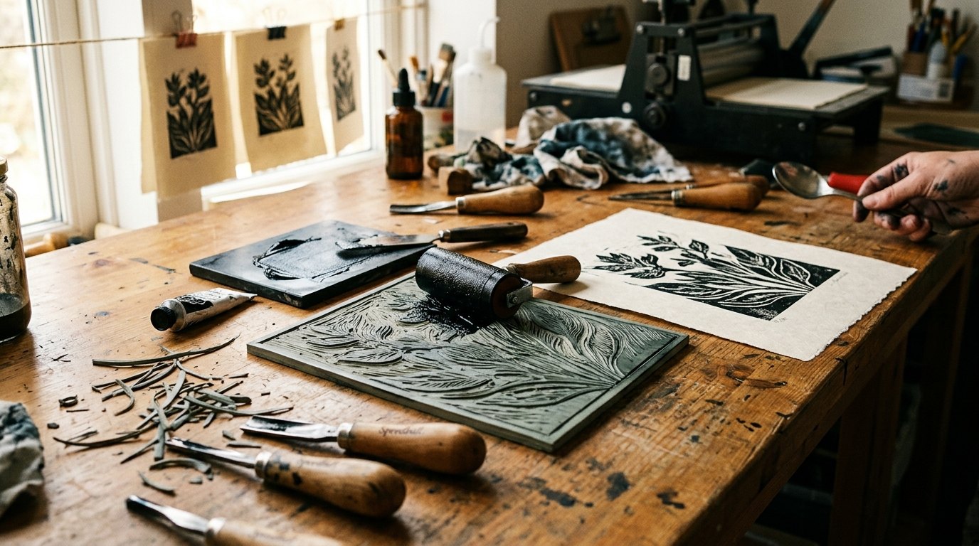
The National Gallery of Art's printmaking guide explains the process with useful plainness. To make a linocut, the artist carves an image into a block of linoleum using a sharp knife or chisel, rolls ink across the surface with a brayer, and then presses paper onto the inked block by hand or with a press.[1] The untouched surface prints; the removed surface does not.[1] That apparently basic fact is the medium's deepest compositional rule.
It changes how an artist thinks about form. In drawing or painting, a line can often be added little by little until it feels right. In linocut, the carved groove is already a negative fact. Once the knife has passed through, that channel is a future absence.[1] The medium therefore carries a mild but constant severity. Every incision is both a mark in the block and a silence in the print.
This is why linocut often feels so architectonic even when the subject is organic or emotional. The artist is not only inventing forms. The artist is organizing survival. Which black masses need to stay connected? Which white gaps can hold the image open? How much can be removed before a figure collapses into noise? Linocut rewards answers that are structural rather than ornamental.
Soft lino forces a different kind of edge
The Victoria and Albert Museum makes the central material point clearly: linocutting is a twentieth-century development of woodcut in which a sheet of lino substitutes for wood, and because lino is soft and easy to cut yet prone to crumbling, it cannot produce very fine lines.[2] That sentence explains a large share of the medium's look. Linocut is not a lesser woodcut. It is a relief process whose material discourages intricate grain-sensitive detail and favors bolder graphic units.[2]
That material bias is why the medium has so often been suited to posters, quick urban rhythms, emblematic figures, and compositions that need to register from a distance. The V&A notes that professional artists, including Picasso, used lino precisely because it carried a typically bold character.[2] The boldness does not come from taste alone. It comes from the block's physical behavior. A soft matrix asks for clear shapes and punishes fuss.
This also means linocut has a special relation to flatness. Instead of fighting the print's broad surfaces, good linocut artists lean into them. They let a black coat become one weight, a road become one ribbon, a sky become one reserve of white, a color passage become one deliberate plate or reduction stage. The image feels strong because the medium refuses to pretend it is something else.
Cheap industrial material became a modern art language
Claude Flight's 1928 handbook, as described by the Metropolitan Museum of Art, is a key historical document because it shows artists recognizing that the medium's apparent modesty was actually an opening.[3] The Met notes that Flight associated linocut with long sinuous lines, simplified shapes, spare decorative elements, and flat planes of color, all of which made it ideal for dynamic images of contemporary life.[3] That phrasing matters. Linocut did not merely survive despite being inexpensive. It became modern partly because it was inexpensive.
The same Met page stresses the social side of the story. Linoleum was machine-made, readily available, and new to fine art, and Flight valued the way amateurs could make prints at home with simple tools and soft lino rather than needing the heavier expertise and infrastructure of older professional print traditions.[3] The medium therefore carried two kinds of promise at once: formal compression and broader access.
That double promise helps explain why linocut could move so easily between classroom, workshop, avant-garde experiment, political print, and gallery wall. Cheapness did not automatically trivialize the form. It widened the field of who could cut, print, repeat, and circulate an image. The medium's material modesty became part of its cultural energy.
Black-and-white pressure and color speed
Gramatté's The Burial shows one side of that energy. The National Gallery's object page identifies it simply as a 1916 linocut in black on thin Japan paper.[5] The simplicity of that description is almost the point. Black ink, pale sheet, and carved contrast are enough to turn a funeral road into a compressed emotional structure. Nothing in the image depends on painterly nuance. Everything depends on where the black remains and how the white channels the eye toward the horizon.[5]
Another path opens in color linocut. The British Museum's page for Lill Tschudi's Pass road records a 1952 color linocut in blue, red, green, and brown and notes Tschudi's direct link to Claude Flight as her former teacher and mentor.[4] That object helps place Flight's ideas back into practice. The medium can stay graphic while becoming fast, mechanical, and directional. Strong cuts and flat colors do not slow the image down. They let roads, signs, trains, and modern movement lock into one visual tempo.[3][4]
Put those two works beside each other and linocut's range becomes clearer. It can be severe and mournful in black, or brisk and infrastructural in color. What joins the two is not subject matter but compression. Linocut asks the artist to simplify without thinning out. The image must remain blunt enough to print cleanly and strong enough to survive reduction.
Why linocut still feels immediate
Linocut endures because it turns limitation into public clarity. The block is soft, the process is subtractive, fine detail is structurally constrained, and the image arrives through reversal.[1][2] Instead of treating those facts as handicaps, the medium converts them into a visual ethic. Say less, cut harder, keep the silhouette honest, and let flatness carry force.
That is why linocut still feels contemporary even in an image made more than a century ago. It understands something that many later image systems keep rediscovering: boldness is not the opposite of nuance. When a medium forces the artist to decide what truly has to remain, reduction can become a more exact form of thought. Linocut's prints look blunt because the medium has already done a great deal of editing before the paper ever meets the inked block.
Sources
- National Gallery of Art, "Printmaking Basics" - process overview explaining how linocut is carved, inked with a brayer, and printed from the uncut surface while removed areas stay blank.
- Victoria and Albert Museum, "What is print?" - overview noting that linocut is a twentieth-century offshoot of woodcut, that lino is soft but poor at very fine lines, and that the medium's character tends toward boldness.
- The Metropolitan Museum of Art, "Claude Flight - Lino-cuts: A Hand-book of Linoleum-Cut Colour Printing" - collection page on Flight's defense of linocut as a machine-age, inexpensive, democratizing medium suited to dynamic contemporary life.
- The British Museum, "Pass road" - object page for Lill Tschudi's 1952 color linocut, including its palette, technique, and the museum's note that Tschudi sent the print to Claude Flight, her former teacher and mentor.
- National Gallery of Art, "The Burial (Begrabnis)" - object page for Walter Gramatté's 1916 linocut in black on thin Japan paper, used here as a key close-reading example.