Japanese byobu are easy to flatten in reproduction. On a screen, a folding screen becomes a long rectangle, and the viewer is tempted to read it as a painting that happens to have creases. That is the wrong starting point. A byobu is a room-making object first: a portable wall, a light catcher, a privacy device, a seasonal display, and only then a picture surface. The art does not merely sit on the screen. It uses the screen's ability to fold, stand, divide, reflect, and be rearranged.[2][3]
Ogata Korin's Irises at Yatsuhashi (Eight Bridges) at The Metropolitan Museum of Art makes the point with unusual clarity. The work is a pair of six-panel folding screens, painted after 1709 in ink and color on gold leaf on paper, each screen more than eleven feet wide in image area.[1] The irises rise in repeated purple and green masses. The bridge cuts diagonally across both screens. The gold ground refuses ordinary landscape depth. The Met explicitly notes that the artwork is meant to be viewed from right to left, which means the format controls the sequence of looking before interpretation even begins.[1]
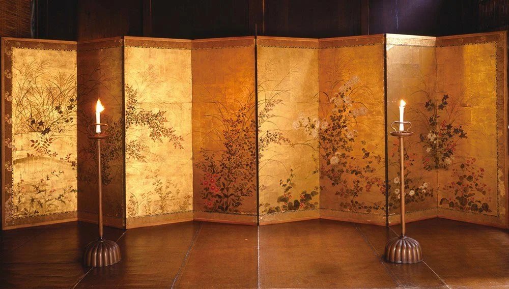
Image context: the lead image is not a diagram or a decorative flat reproduction. It shows folding screens as room objects, with angled panels, floor contact, viewing distance, and exhibition space all visible. That matters because the article's argument turns on physical facts that a catalogue crop tends to suppress: the screen stands, folds, divides space, catches light, and asks the viewer to move.[2][3][6]
A byobu is a portable wall with a painted skin
The Met's essay on folding screens starts with function rather than style. The word byobu combines characters associated with wall, fence, or screen and wind, and the object literally served as protection against wind. In Japanese interiors, screens divided large open spaces into more intimate areas and could help mark zones for dressing, sleeping, display, or outdoor gathering.[2] That origin is not background trivia. It is the technical condition that makes byobu painting different from a panel picture.
If an easel painting waits for a wall, a byobu brings part of the wall with it. It can be angled. It can stand on the floor. It can be stored away. It can be opened wide or bent into a zigzag. The Tokyo National Research Institute for Cultural Properties makes the hinge logic especially concrete: folding screens can be moved to a preferred position, folded and put away when not in use, and adjusted by changing the angles or unfolding the screen, which changes the appearance of the painting.[3] In other words, the viewer never sees a single fixed geometry. The object can alter its own pictorial field.
That is why the folds should not be treated as damage to an otherwise flat image. They are the medium's operating system. A painter working on screens has to know that a line may cross a panel join, that a flower cluster may swell or compress depending on the angle, and that the room's light will hit each plane differently. The screen does not merely receive composition. It makes composition conditional.
Gold is not a background color
Gold grounds can look like luxury, and they are luxury, but in byobu they are also environmental technology. The Met notes that the glimmering gold-leaf surfaces characteristic of folding screens reflected ambient light and enlivened the surrounding space with pictorial scenes.[2] That sentence is useful because it moves gold away from simple iconography. The gold changes the room.
In Irises at Yatsuhashi, Korin uses the gold field to remove ordinary weather and horizon. The flowers do not sit beside a stream in a naturalistic marsh. They occupy a radiant plane where memory, poem, season, and design can coexist without needing a complete landscape.[1][4] The bridge is dark and angular, but it does not create Renaissance depth. It acts more like a moving interval, a series of directional planks that pull the eye across the paired screens.
The Nezu Museum's related National Treasure Irises screens help clarify Korin's larger method. The museum identifies its work as a pair of six-panel screens in ink and color on gold-foiled paper and calls it one of the icons of Japanese painting history.[4] In its 2024 exhibition text, Nezu went further, describing the Irises screens as straddling painting and design, emphasizing azurite blue flowers, malachite green leaves, and a geometric layout on a planar surface.[5] That framing also helps with the Met's Yatsuhashi pair: the screen is not trying to hide design behind illusion. It lets design become the event.
Gold does one more thing. It makes spacing active. Empty areas in a byobu are not blank gaps waiting to be filled. They are light-bearing zones. The viewer's body, the room's illumination, and the angle of the panels all change how the gold reads. This is why an image of irises can feel spacious without traditional depth. The space is not inside the painted world alone. It is partly in front of the object, in the room where the gold catches and releases light.[2]
The hinge turns sequence into vision
The Met's object page for Irises at Yatsuhashi gives the literary key: the bridge and irises refer to an episode in The Ise Stories, in which an exiled protagonist reaches Yatsuhashi, where a stream branches into eight channels, and the sight of irises prompts a poem of longing for the wife left behind in Kyoto.[1] That narrative matters, but Korin does not illustrate it by filling the screen with travelers, water, and sentimental detail. He reduces the story to irises, bridge, direction, and interval.
The format makes that reduction legible. Since the work is meant to be viewed from right to left, the bridge does not simply sit as a motif. It becomes a path for the eye.[1] The repeated panels make that path feel broken and resumed, exactly the kind of movement a traveler or poem might require. The flowers cluster and disperse. The bridge enters, disappears, and reappears as the pair unfolds. The screen's own structure turns looking into crossing.
This is where byobu can feel surprisingly cinematic, but the better analogy is architectural. A film fixes the sequence. A byobu lets the sequence depend on stance, opening angle, and room position. The viewer may read across the pair as a broad field, then step closer and feel each panel become a separate beat. A slight bend can make one group of irises advance while another falls away. The composition is stable enough to be recognizable and variable enough to keep the act of looking alive.
The support is engineered, not incidental
The material structure beneath a byobu is easy to miss because a successful screen hides its engineering. The Tokyo conservation guide describes the painted paper surface as supported by about six layers of paper pasted together. Those layers support the honshi, the main artwork surface, and also help regulate humidity levels.[3] The same page explains that the inner wooden core and lining papers deteriorate over time, so restoration can require taking the entire screen apart, removing the honshi, repairing it from the reverse, and replacing backing materials.[3]
That construction changes the aesthetic stakes. A byobu is not just a large image on paper. It is a layered humidity-management object designed to stand, fold, open, close, travel, and survive use.[3] The painting depends on that hidden body. If the paper layers fail, the surface can distort. If the hinges fail, the screen loses the very movement that gives it meaning. If the backing damages the honshi, the picture is affected from behind.
This is one reason screen conservation can feel closer to architectural conservation than to ordinary picture repair. The object is a small building with a painted face. Its surface, supports, hinges, and room behavior all matter. The technical underside confirms the article's central claim: byobu painting is never only an image problem. It is a furnishing problem, a climate problem, a paper problem, and a choreography problem.
Why Korin's irises still look modern
Korin's Irises at Yatsuhashi can look modern because it refuses clutter. But calling it modern only because it is simplified misses the older intelligence of the object. The work is economical because the screen format rewards economy. Large paired surfaces need motifs that hold at distance. Panel breaks need rhythms strong enough to survive interruption. Gold grounds need forms that can stand against light rather than dissolve into it. A room-making object cannot rely only on tiny detail.[1][2]
The Nezu Museum's 2024 description of Korin's Irises as anticipating graphic design is especially sharp for this reason.[5] Graphic force here does not mean flatness as a compromise. It means clarity engineered for movement, repetition, and display. Purple flowers and green leaves become modules. Gold becomes atmosphere. The bridge becomes a directional device. The panel sequence becomes pacing. The whole object behaves like a designed environment compressed into portable form.[1][5]
That is why byobu matter beyond Japanese art history specialists. They test a larger claim about what painting can be. A painting does not always need to pretend that its surface is a window. It can be a wall that knows it is a wall, a folding object that lets the room participate, a gold skin that changes with light, or a paired field that turns reading into bodily motion. Korin's irises do not ask us to forget the screen. They ask us to understand that the screen is the painting's real intelligence.[1][2][3][5]
Sources
- The Metropolitan Museum of Art, "Irises at Yatsuhashi (Eight Bridges)" - official object page for Ogata Korin's pair of six-panel folding screens, including date, medium, dimensions, right-to-left viewing note, literary source, public-domain image, and object number.
- Terry Satsuki Milhaupt, "Interiors Imagined: Folding Screens, Garments, and Clothing Stands." The Metropolitan Museum of Art, Timeline of Art History, 2009 - essay on byobu function, gold-leaf surfaces, interior division, privacy, wealth display, and screen placement.
- Tokyo National Research Institute for Cultural Properties, "Byobu folding screens" - conservation overview explaining movable placement, folding angles, paper hinges, common panel formats, layered paper support, humidity regulation, and restoration workflow.
- Nezu Museum, "Irises" - collection highlight for Ogata Korin's National Treasure pair of six-panel screens, with Edo-period date, medium, dimensions, and status as an icon of Japanese painting history.
- Nezu Museum, "The Irises Screens, National Treasure: Japanese Art and Design" - 2024 exhibition page describing Korin's irises as a boundary between painting and design, with azurite blue flowers, malachite green leaves, planar geometry, poetic reference, and graphic-design force.
- Japan Objects, "Byobu: 7 Things to Know About Japanese Folding Screens" - visual and craft overview used for the immersive folding-screen exhibition photograph and room-context framing.
Editor’s Pick Review
This article takes the merged standard/add-on editor-pick slot because it makes a medium-specific art argument feel spatial, legible, and alive. The essay does not treat byobu as flat reproductions with decorative creases; it follows hinges, paired six-panel format, gold ground, layered paper support, right-to-left viewing, and Korin’s iris-and-bridge rhythm until the central claim becomes unavoidable: the screen is not a container for the painting, but part of the painting’s intelligence.
It also clears the stricter 24-hour visual and bilingual gates cleanly. The cover is an immersive, topic-grounded exhibition photograph of folding screens standing in a room, not an analytical diagram, generated image, or flat artwork crop. The Chinese edition is especially strong for an art pick: terms around byobu, gold ground, support structure, sequence, and room-making stay clear, while the prose keeps visual texture and critical rhythm without falling into translationese.