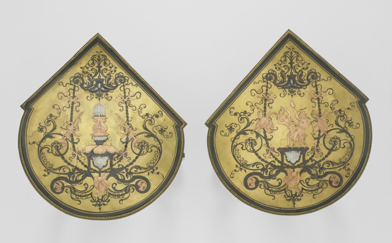
A brass ground makes an unexpectedly restless background. Dark ornament winds across it, but the light belongs to the space around the pattern. In the V&A photograph above, two table tops let that reversal play out across broad, gleaming fields. Look first at a curling dark shape, then at the metal surrounding it. The same boundary begins to describe two different things.
The museum dates these small tables to 1701–1720 and attributes them, cautiously, to André-Charles Boulle. Their tops combine engraved turtle shell, pewter, and copper on brass: a version of marquetry called contre-partie.[1] Its visual richness begins with a surprisingly economical workshop idea. Cut different materials together, exchange the pieces, and the same design can appear with its light and dark relationships reversed.
That operation offers a way into furniture whose ornament can initially feel overwhelming. Follow one edge. Ask what was cut, what lies underneath, and what keeps the pieces together.
The cut makes both sides
In marquetry, thin pieces of contrasting materials form a decorative surface. The important action happens before that surface reaches the furniture. Describing a cabinet made in Würzburg in 1716, V&A researcher Sophie Cope explains that the materials were flattened and brought to the same thickness, assembled in a packet, and cut with a design attached above. Cutting proceeded outward from the center. The resulting pieces could then be arranged into light and dark patterns.[2]
Imagine a simple leaf cut through a sheet of metal stacked with a sheet of shell. Separate the layers and there are two leaves, plus two surrounding fields. Put the metal leaf into the shell field; put the shell leaf into the metal field. A single outline has supplied the matching boundaries for two contrasting arrangements. The Château de Versailles describes this exchange as the basis of Boulle's partie and contrepartie: metal ornament against shell, and shell ornament against metal.[3]
In the first arrangement, a bright line seems to travel across darkness. In the second, light spreads through the background and the ornament interrupts it. That difference is more than a change of palette. It changes where the eye finds continuity. The maker can make a tendril read as a shining path or as a dark incision into a luminous field.
The two V&A tops pictured here both have brass grounds. They illustrate the second arrangement; they are not a photographed pair of opposite versions.[1] The distinction matters because a matching pair of tables need not display both products of the cutting process.
A surface still has to become furniture
Cutting the pattern was only part of the work. Cope describes marquetry panels assembled on paper and available for purchase before their application to furniture. Her Würzburg example has curved surfaces, including its doors, which made fitting the decoration a demanding task. She also cautions that the availability of prepared panels complicates identifying who actually cut that cabinet's marquetry.[2]
A finished cabinet can therefore conceal several kinds of labor. Designing an ornament, cutting its components, and fitting a panel around a shaped surface are distinct accomplishments, even when the eye receives them as one continuous skin. A catalog name cannot always tell us how those tasks were divided.
The term “Boulle” needs similar care. Versailles identifies Boulle as a major developer of a technique he did not invent; the V&A also notes how widely his furniture was imitated.[1][3] Recognizing the material vocabulary does not, by itself, establish the maker. On the photographed tables, “probably” is part of the attribution, as necessary as the name.
Color comes from below
Metal and shell can suggest a narrow palette: yellow against brown, brightness against shadow. Conservation research has recovered a more colorful practice. Writing for the Wallace Collection, furniture conservator Marc-André Paulin describes blue, red, and black pigments applied to paper beneath Boulle's shell veneers. Color could enter the surface from a layer the viewer never directly sees.[4]
Paulin also discusses analysis of a floral marquetry wardrobe in the Louvre. Copper- and iron-based pigments were identified in areas of its wood decoration, part of a practice that produced green and blue effects. Boulle's furniture combined the colors of materials with deliberate interventions in those colors.[4]
This evidence changes how to look at an apparently brown passage. Its appearance may involve the shell, a backing, and the history of those layers. It would be a mistake to assign a particular hidden pigment to the V&A tables from this photograph alone. The broader lesson is to read the visible surface as the result of construction, rather than assume that every color belongs naturally to the substance on top.
The seam keeps working
The most elegant boundary in the design is also a place that can come apart. The Wallace Collection describes Boulle furniture as especially vulnerable to environmental changes, including fluctuations in humidity. Brass, shell, wood, and their joins have to survive together. By the early twentieth century, losses of inlay had become a serious problem for the collection.[5]
Conservation now includes controlled clamping to secure loose marquetry, careful choices of adhesives and coatings, and detailed documentation. The Wallace's account emphasizes the possibility of treating an object again in the future. It also describes improving the appearance of corroded mounts without excessive cleaning.[5] A uniformly brilliant surface is not the only measure of successful care.
Return to the dark scroll against brass. At viewing distance it is an effortless flourish. Up close, it becomes a succession of fitted edges. The splendor depends on keeping those two experiences together: the ease of the ornament and the exacting physical work that allows it to remain a surface.
Sources
- Dawn Hoskin, “Selecting Furniture & Sculpture Part I,” Victoria and Albert Museum (2014) — identification, attribution, materials, and photographs of the tables, V&A 1015-1882.
- Sophie Cope, “The Cabinet with the Letter: Luxury and Poverty in 18th-Century Würzburg,” V&A Online Journal, issue 6 (Summer 2014), especially pp. 70–71 — packet cutting, prepared panels, and curved surfaces; complete issue PDF.
- Château de Versailles, “André-Charles Boulle” — the cabinetmaker's role and the reciprocal construction of partie and contrepartie marquetry; in French.
- Marc-André Paulin, “Boulle's Materials and Techniques,” The Wallace Collection — technical research on colored veneers and pigmented backings.
- The Wallace Collection, “Conserving Boulle furniture at the Wallace” — environmental vulnerability, treatment history, clamping, and principles of conservation.