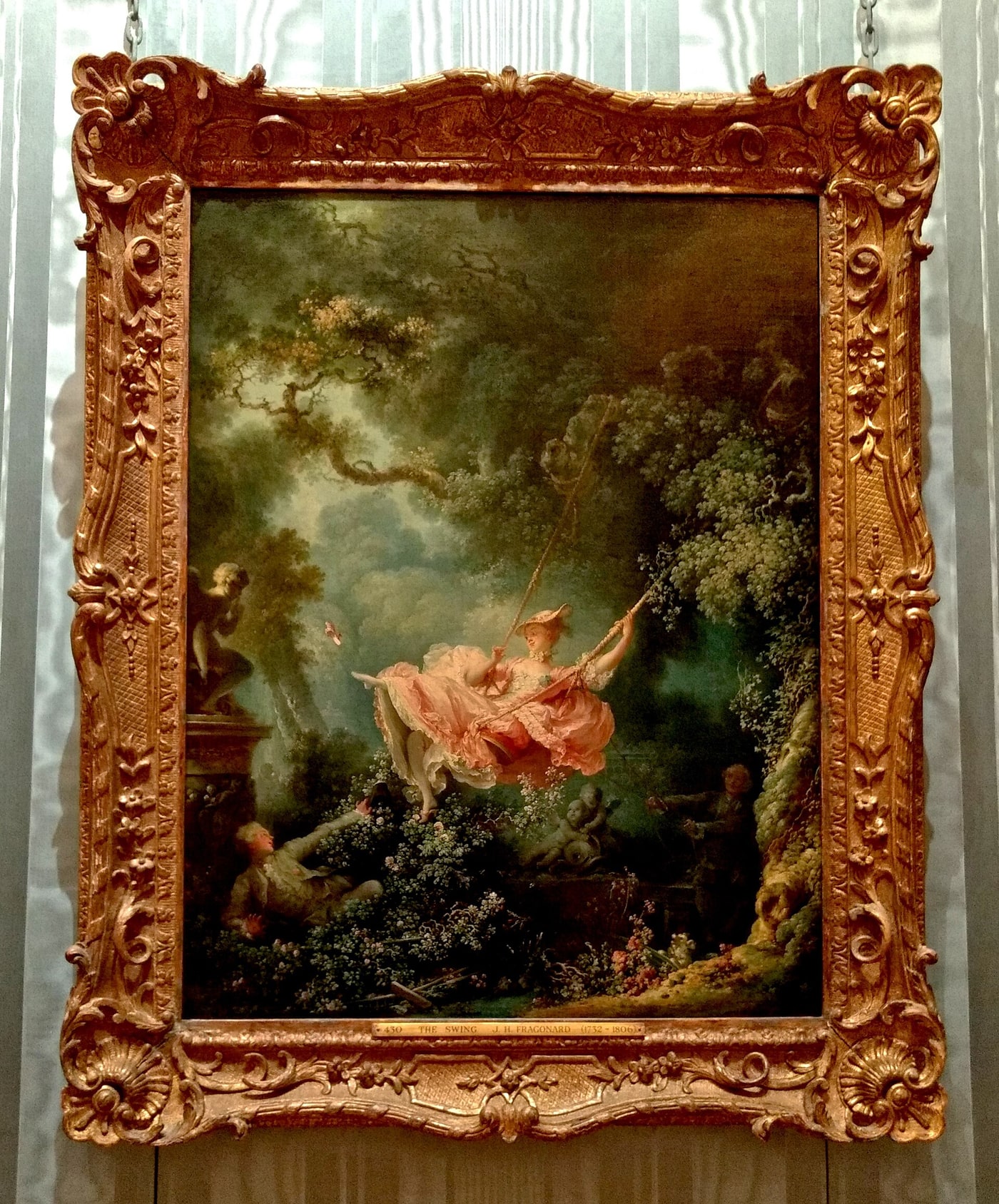
Image context: this article uses one real photograph of Fragonard's actual painting hanging at the Wallace Collection. The visible frame and gallery wall matter to the argument: pink is never encountered alone, but inside materials and settings that tell it how to behave.[1][6]
Pink attracts interpretation before it attracts looking. Call a painting pink and a ready-made vocabulary arrives: pretty, tender, girlish, sugary, romantic. The words feel natural because the color has been trained by clothes, toys, packaging, bodies, flowers, politics, and advertising. They are not natural. They are assignments.
European dress history alone should make any fixed reading suspect. The Victoria and Albert Museum notes that fashionable men wore pink in the 1700s as a sign of wealth and power; only in the first half of the twentieth century did the color become firmly associated with femininity in the West.[5] Art does not stand outside those changes. It borrows them, accelerates them, and sometimes makes them visible enough to resist.
Four works show how much labor one color can perform. In Jean-Honoré Fragonard's The Swing, pink turns silk into erotic theater. In Pablo Picasso's Family of Saltimbanques, rose drains entertainment of sociability. In Philip Guston's The Studio, fleshy pink brings the painter uncomfortably close to the evil he depicts. In Portia Munson's Pink Project, thousands of discarded products expose color as an industrial system for sorting consumers.
Pink is not the same symbol moving through these works. It is the unstable point where material, social expectation, and artistic form meet.
Fragonard makes pink perform
In The Swing, painted about 1767, a young woman flies through a dark garden in a froth of pink silk. Her older husband controls the ropes from the shadowed right side. Her younger lover reclines at lower left, placed to enjoy the view beneath her rising skirt. One slipper has already left her foot; his lifted hat answers the airborne gesture. The Wallace Collection describes the scene without euphemism: the woman is suspended between husband and lover, and the swing grants the lover a privileged sightline.[1]
The dress is the painting's engine. Its folds spread wider than the woman's torso, catching light in salmon, coral, shell, and almost-white. Fragonard does not fill the whole canvas with pink. He compresses the color into the mobile center, then surrounds it with moss, bark, leaves, stone, and deep green-brown shadow. The eye finds the silk because the garden seems to exhale it.
That concentration changes the color's meaning. Pink is not merely an adjective attached to femininity; it is choreography. It records the swing's forward rush, makes the skirt's exposure legible, and binds luxury to risk. The woman appears to command the spectacle—she kicks away her shoe and looks toward her lover—but the scene is also organized by male sightlines and by a husband literally holding the ropes. Pleasure and control occupy the same color field.
The historical wardrobe matters here. Expensive dyes and brilliant dress colors still carried status in eighteenth-century Europe, and pink was not restricted to women.[5] Fragonard's silk therefore signals fashionable display before it can be reduced to a modern "girl color." Yet the painting gives that display a specifically erotic job. Pink becomes public evidence of a private arrangement.
The cover photograph preserves another layer of performance. Seen inside its carved gilt frame, the painted dress is smaller than memory tends to make it.[6] Gold, glass, wall, and hanging chains surround the canvas. The color's apparent spontaneity arrives through a heavily staged object.
Picasso takes the comfort out of rose
Picasso's Family of Saltimbanques of 1905 appears, by period label, to offer an easy sequel. It belongs to the works commonly grouped as his Rose Period. But rose here does nearly the opposite of Fragonard's pink.
Six circus performers occupy a broad, dusky landscape. A harlequin, jester, acrobat, children, and seated woman share the canvas without cohering into a scene. The National Gallery of Art emphasizes their lack of eye contact, shadowed eyes, and only tentative bodily links. Picasso identified closely with these itinerant entertainers living at the margins of Paris and inserted his own profile into the harlequin at left.[2]
The color does not announce a show. It cancels the difference between stage and wasteland. Peach skin, faded costumes, dusty ground, and rose-gray air seem to have passed through one exhausted atmosphere. The little girl's pink dress is not a sparkling focal point like Fragonard's silk; it is one interval in a palette that makes every figure feel exposed and remote.
This is why "Rose Period" can mislead if it is heard as mood. The color family is warmer than Picasso's preceding blues, but warmth does not produce intimacy. The figures barely connect. The seated woman occupies her own patch of ground. Hands and feet approach one another without resolving the group into domestic belonging.[2]
Picasso also revised the large canvas repeatedly. The Gallery's account notes uneven paint handling and earlier circus compositions beneath the visible surface.[2] Rose is therefore not a single wash of emotion laid over a finished idea. It is the atmosphere left by revision—a field in which entertainers, artist, and landscape have been brought together but not reconciled.
Fragonard uses concentrated pink to make one body socially electric. Picasso disperses rose until a whole group seems unable to reach itself.
Guston makes pink complicit
Philip Guston did not treat pink as an occasional effect. In a 1973 reflection quoted by the Museum of Fine Arts, Boston, he named "red and pink and grays and blacks and ochres" as colors to which he felt attached.[3] That attachment survived his turn from acclaimed abstraction back to blunt, cartoon-like figures in the late 1960s.
The Studio of 1969 puts the problem inside the painter's room. A hooded Ku Klux Klansman sits at an easel, brush in a red hand, painting the profile of another hooded figure—or perhaps himself. The MFA reads the work as Guston's imaginative donning of the hood: not a portrait of evil safely located elsewhere, but a self-implicating question about the artist's place within a racist society.[3]
Pink is crucial to that collapse of distance. Guston's bodies, hands, bricks, shoes, and grounds often occupy a narrow family of bruised rose, meat pink, red, gray, and black. In The Studio, the palette refuses the antiseptic contrast that a white hood might otherwise promise. The painter's hand is red; the room feels bodily; the hood belongs to the same thickly painted world as the tools of art.
This does not make pink a moral code for guilt. It does something harder. The color keeps comedy, flesh, paint, and violence from separating cleanly. The figure looks absurd, but absurdity does not neutralize him. The studio looks invented, but its easel, brushes, clock, window shade, and cigarette identify it with Guston's own working life.[3] Pink helps the image hover between caricature and confession.
The strongest inference is not that Guston "corrupted" an innocent color. Pink was never innocent. Rather, he exploited its closeness to skin and its reputation for softness, then made both associations carry moral weight. The result is intimate where a viewer might prefer distance.
Munson turns pink into an inventory
Portia Munson's Pink Project begins where a consumer aisle ends. First exhibited in the New Museum's Bad Girls exhibition in 1994, the installation gathers thousands of discarded pink things: hair clips, pacifiers, fake fingernails, combs, sex toys, cleaning products, tampon applicators, kitchen gadgets, and children's toys, among many other categories. Munson has arranged the collection on a table and reworked it as vitrines, a mound, a bedroom, and a glass coffin.[4]
No single shade dominates. Bubblegum, salmon, dusty rose, fuchsia, peach, and translucent plastic collide. At a distance, the objects merge into a chromatic mass. Up close, they separate into instructions about grooming, cleaning, soothing, beautifying, mothering, serving, and sexual availability.
The shift from painting to installation matters. Fragonard, Picasso, and Guston choose where to apply pigment. Munson collects a decision already made by manufacturers. Here pink is a preexisting classification system stamped into plastic before the artist touches it. Her act is to sort the sorting.
Accumulation makes that system visible. One pink comb can look like personal taste; hundreds of pink grooming tools reveal a market category. One toy may seem harmless; a table dense with miniaturized domestic equipment and beauty products shows how early and repeatedly femininity is rehearsed through goods. Munson describes the work as exposing both the marketing of femininity and its infantilization.[4]
Yet the installation is not visually puritanical. It is funny, excessive, seductive, and appalling at once. Its pleasure is part of its evidence. If the objects were merely ugly, their commercial logic would be easier to dismiss. Pink works because attraction and prescription can arrive in the same package.
A color is a relationship
These four works do not form a clean history in which pink progresses from bad stereotype to liberated expression. Fragonard's dress contains agency and surveillance. Picasso's rose contains warmth and estrangement. Guston's pink contains painterly pleasure and implicated violence. Munson's installation criticizes consumer coding while depending on its spectacular abundance.
What changes is not a color chip. What changes is the relationship around it: silk against foliage, bodies against empty land, a red hand against a white hood, discarded plastic against more discarded plastic. Scale changes it. Material changes it. Who wears it, buys it, paints it, and looks at it changes it.
That is why pink remains so useful to artists. It arrives overdetermined. Viewers think they know what it says, which gives an artwork something immediate to reroute. Fragonard can make it conspiratorial; Picasso can make it lonely; Guston can make it morally adhesive; Munson can reveal it as shelf-level infrastructure.
Art does not uncover pink's one true meaning. It shows that every apparent meaning has been built—and can be assigned another job.
Sources
- The Wallace Collection, "Les hasards heureux de l'escarpolette (The Swing)" — collection interpretation of Fragonard's scene, its pink silk dress, husband, lover, slipper, and carefully staged sightline.
- National Gallery of Art, "Family of Saltimbanques" — object record, visual description, audio transcript, dimensions, revision history, and interpretation of Picasso's rose-hued group of marginal performers.
- Museum of Fine Arts, Boston, "Philip Guston Now: Wall Texts" — Guston's account of his preferred palette and the exhibition's contextual reading of The Studio, his return to figuration, and the hooded painter as self-implication.
- Portia Munson, "Installations" — the artist's account of Pink Project, its 1994 debut, discarded consumer objects, changing installation formats, and critique of marketed femininity.
- Victoria and Albert Museum, "In the pink: colour in menswear" — institutional history of pink in eighteenth-century European dress, expensive dyes, changing gender associations, and later subversions.
- Wikimedia Commons, "File: Fragonard, The Swing, Wallace Collection.jpg" — source page for Philafrenzy's real 2016 photograph of the framed painting at the Wallace Collection, used as this article's single image.