
Piet Mondrian's late paintings are often flattened twice before a viewer ever reaches them. First they are simplified into a design language: black grid, white ground, a few primary colors, modern calm. Then they are flattened again in the mind as if those straight lines must have been produced by a cool, almost mechanical certainty. LACMA's short conservation video on Composition in White, Red, and Yellow is valuable because it reverses both habits.[1][2][4] It makes the painting look hand-made, vulnerable, and physically negotiated.
That change in emphasis matters. LACMA's De Stijl guide describes Mondrian's severe restriction to horizontal and vertical lines plus black, white, and the primary colors as a search for equilibrium and spiritual order.[4] The museum's current collection record reinforces the object's institutional clarity: a small oil on canvas by Mondrian, on view in the Broad Contemporary Art Museum, carrying the Harrison Collection credit line and a provenance that runs from the artist to LACMA.[3] Seen at that distance, the work can feel almost schematic, as if the grid existed before the paint.
The conservation note pulls the viewer to the opposite scale. Conservator Elma O'Donoghue explains that the visible cracking had become distracting in the gallery and that treatment was meant to recover more of the painting's original appearance.[2] The video and interview also make a subtler point. The painting's order depends on a surface that can lift, split, catch light awkwardly, and demand touch sensitive enough to respect its brush texture.[1][2] The grid here is not an escape from material life. It is material life, held in a highly disciplined arrangement.
LACMA's own dating around the work is slightly split, with the conservation post and gallery guide calling it a 1936 painting while the current collection record lists 1938.[2][3][4] That discrepancy does not change the visual argument, but it does quietly reinforce the video's lesson. Even a canonical Mondrian reaches the viewer through an ongoing museum life of cataloging, hanging, lighting, and treatment. The object stays active.
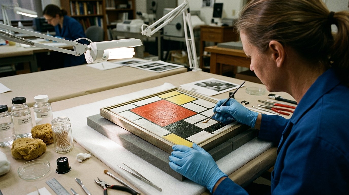
Image context: the cover uses an immersive conservation-lab scene rather than a flat reproduction, chart, or analytical diagram. That is the right image here because the article is not really about Mondrian as a logo for modernism. It is about what happens when the camera gets close enough for cracks, fingertips, and brush ridges to interrupt that logo.
Around 0:00, the video begins with damage rather than design, and that changes what the painting is for
The first useful surprise is that the video does not open by honoring the grid from a respectful distance.[1] It opens close, where the work looks less like an icon of abstraction and more like a painted skin with problems. In the companion text, O'Donoghue says the cracking had become hard to light around and interfered with appreciation of the picture in the gallery.[2] That is an unusually revealing sentence. It tells the viewer that the painting's public life depends on more than composition and reputation. It also depends on whether the surface can still carry its own visual terms without deterioration pulling the eye away.
This is important for Mondrian because the usual shorthand about him emphasizes austerity so strongly that viewers can forget his paintings are tactile decisions made in oil paint. LACMA's De Stijl guide says he sought equilibrium through strict reduction.[4] The conservation video adds the missing cost of that reduction. Equilibrium has to survive as a physical surface. The white fields are not blank concepts. They are paint passages that can crack. The black bars are not pure structure. They sit on canvas and age with it.[1][2]
Around 0:20, the adhesive sequence makes the grid look handmade again
The middle of the video becomes strongest once O'Donoghue starts explaining materials. She identifies the adhesive as isinglass, a purified fish glue, and says she first applies ethanol so the adhesive will wick into the crack and along its edges.[2] That description is technical, but its effect on the viewer is aesthetic. A Mondrian that may once have seemed all hard geometry starts to read as a narrow threshold between order and fragility. The treatment works by capillary movement, tiny quantities, and careful entry into the split. Nothing about the procedure is broad or industrial.
That closeness also reveals something about looking at Mondrian correctly. The grid is often taught as a denial of touch, yet the video is full of evidence to the contrary. Adhesive is guided with a fine brush. Excess is removed from the face of the painting because shine, yellowing, and residue would change what the surface does over time.[2] Every step assumes that small surface differences matter. The painting asks for control, but the control is tactile rather than merely conceptual.
Around 1:00, the hairdryer and bare fingertips show why the surface cannot be flattened into theory
The most memorable passage comes when O'Donoghue explains why she uses low heat from a hairdryer and gentle finger pressure instead of a heated spatula.[2] The reason is precise: the white paint has a strong vertical brush texture, and a more forceful contact method could flatten the tops of those ridges.[2] This is the moment when the video does its deepest interpretive work. It shows that Mondrian's apparently impersonal rectangles still store directional brush movement. The surface is not mute. It has grain.
That matters beyond conservation. LACMA's De Stijl note describes Mondrian's art as equilibrium, spiritualism, and strict visual vocabulary.[4] The treatment video reveals that this order never canceled the body's role in making the picture. The vertical texture running through the white paint means the painting keeps a memory of application inside its purified form.[2] Up close, the grid is not static law. It is rhythm slowed down and held in place.
O'Donoghue's explanation for using uncovered fingertips pushes that point further. She says bare fingertips provide the sensitivity needed to feel pressure immediately, though they must stay immaculately clean to protect the paint surface.[2] This is a conservation decision, but it also becomes an interpretive clue. A painting many viewers associate with severe abstraction turns out to require fingertip judgment at the moment of care. The right way to handle it is neither detached nor expressive in a romantic sense. It is disciplined touch answering disciplined form.
The real lesson of the video is that Mondrian's order depends on tension, not on chill
By the end, the video's achievement is less about restoration spectacle than about scale. From far away, the painting can still look like an ideal grammar of modern abstraction.[3][4] Up close, it becomes a stressed object whose authority depends on conserving ridges, edges, gloss, and flexibility with unusual restraint.[1][2] The grid remains rigorous, but rigor no longer means lifelessness.
That is why this short video deserves an annotated viewing. It teaches that Mondrian's calm is made, not given. The painting is orderly because pressure has been continuously managed: first by Mondrian's own brushwork and color limits, later by museum lighting, hanging, cataloging, and now by painstaking crack treatment.[2][3][4] Once the viewer sees that, the picture stops behaving like a universal logo and starts behaving like what it always was: a small, exacting oil painting whose surface tension is part of its meaning.[1][2]
Sources
- LACMA, "Art + Work | Treating cracked paint on a Piet Mondrian painting," YouTube video.
- LACMA Unframed, "Treating Cracks on a Piet Mondrian Painting" - conservation note and interview with Paintings Conservator Elma O'Donoghue.
- LACMA Collections, "Piet Mondrian, Composition in White, Red, and Yellow, 1938" - current collection record, dimensions, credit line, and provenance note.
- LACMA, "De Stijl" - gallery guide text on Mondrian's restricted vocabulary, equilibrium, and objecthood.