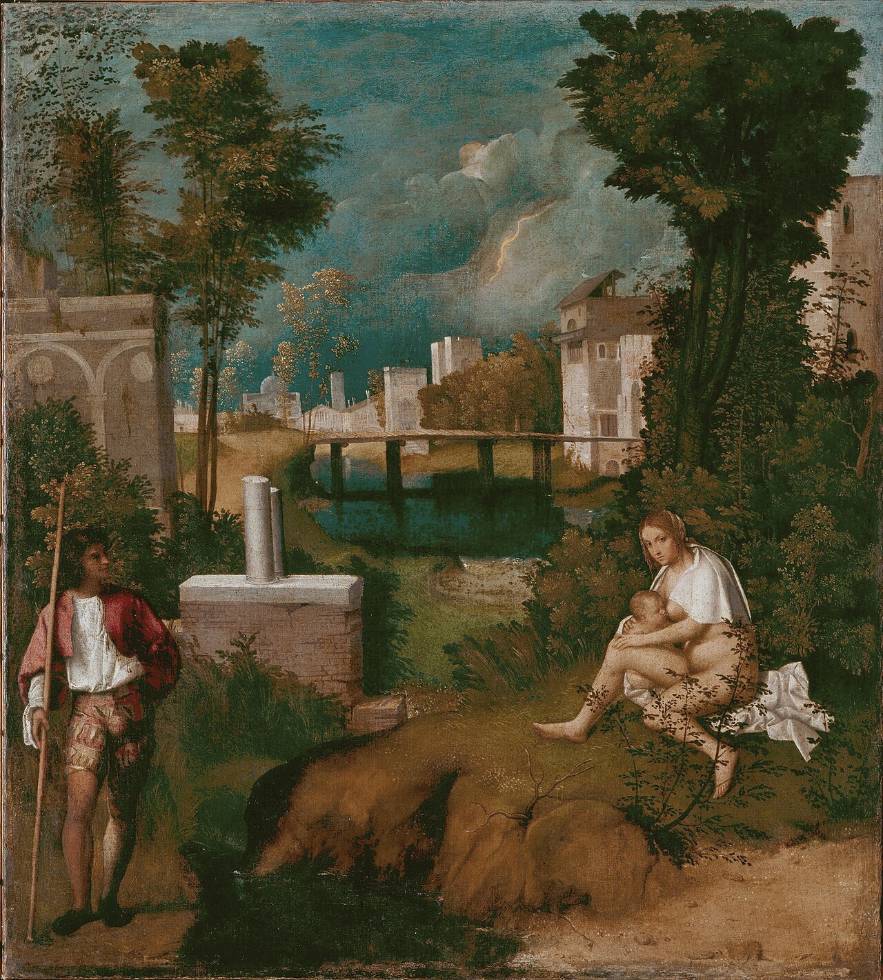
Few Renaissance paintings are as famous for ambiguity as Giorgione’s The Tempest, but the most useful way to approach it is less “iconography puzzle first” and more “paint behavior first.” The work is small—catalogs often list it around 82–83 × 73 cm—yet it feels spatially unstable in a way that larger narrative paintings often do not.[1][2] That instability is not accidental atmosphere. It is built through medium choices: oil on canvas handling, wet tonal transitions, and local highlights that appear and dissolve as you scan the surface.
The usual question is “who are these two figures?” A better opening question is: what technical system makes those two figures feel both present and narratively unresolved? Once you track that system, the painting starts reading less like an unsolved riddle and more like a deliberate experiment in Venetian seeing.
Image relevance note: the hero image is the artwork itself, used as direct evidence for technical observations about tonal continuity, spatial stitching, and atmospheric structure.
1) Canvas + oil in Venice: why support and medium matter before interpretation
Venice had practical reasons to favor canvas in the late 15th and early 16th centuries (humidity, shipping, workshop scale), and the Giorgione/Titian generation used that support to push color-led painting in ways panel conventions constrained.[3][4] In The Tempest, the canvas support is not just material context; it helps explain the picture’s breathing transitions between zones.
On rigid panel, hard contour and crisp compartmentalization can dominate unless deliberately countered. Here, figure, masonry, river, and sky sit in a more permeable tonal field. Edges are often calibrated rather than asserted. This is one reason the painting can feel “quietly moving” even while almost nothing happens narratively.
The key technical effect is continuity without full clarity: each zone is readable, but boundaries do not lock into a single interpretive hierarchy. That is exactly the condition that keeps iconographic certainty open.
2) Weather as structure: the lightning is a compositional regulator, not only a symbol
Most viewers remember the bolt. In many readings it acts as symbolic trigger, but at medium level it also regulates the value system.[1][2] The sky compresses into a charged gradient that pushes the green-blue ground into relative luminosity while keeping both figures inside the same weather envelope.
This matters because the storm is not painted as theatrical backdrop with a separate “foreground drama.” Instead, weather stitches the scene’s parts into one exposure regime. The male figure, nursing woman, bridge, and ruined architecture share a common atmospheric pressure.
In practical viewing terms, this means your eye does not settle in one narrative center for long. It cycles: figure pair → sky threat → water/architecture → figure pair again. The painting teaches recursive looking.
3) Figure handling: why relational ambiguity survives close looking
The standing male figure and seated nursing woman are painted with enough specificity to anchor the scene, but not with the kind of narrative cues that would settle role, sequence, or shared action.[1][3] Technical handling supports that ambiguity in three ways:
- Pose clarity, motive opacity: posture reads clearly; intention does not.
- Local finish, global indeterminacy: body zones are articulate, but the scene-level logic remains open.
- Directional glances without narrative lock: sightlines suggest relation while refusing closure.
Scholars have long proposed mythic, biblical, allegorical, and patron-linked readings; no consensus has displaced all rivals.[1][4][5] The endurance of that pluralism is often treated as iconographic failure. Technically, it looks more like design success: Giorgione built a picture where material coherence and narrative underdetermination coexist.
4) The “small painting, large weather” problem: scale engineering in a compact format
At roughly 0.60 m² image area (using 82 × 73 cm as a baseline), The Tempest creates a weather event that feels larger than its support.[1][2] That scale effect comes from depth staging rather than literal size:
- near-ground figures with immediate flesh and cloth contrast,
- a middle-distance bridge/architecture seam,
- far atmospheric recession with lightning compression.
Because tonal transitions are prioritized over hard linear segmentation, these strata do not read as three separate strips. They phase into one another. The result is a painting that behaves like a microclimate, not a static tableau.
This is a useful correction to the “mystery painting” cliché: the work’s long life is not only about unresolved subject matter; it is also about how efficiently it turns limited dimensions into high atmospheric range.
5) Provenance and durability: why this specific object stayed central
The painting is documented in early Venetian collecting history (including association with Gabriele Vendramin and sixteenth-century inventory notice chains) before entering later collections and eventually the Gallerie dell’Accademia.[1] That continuity matters because it confirms the work was legible as a high-value object long before modern art history elevated ambiguity as a virtue.
In other words, the painting’s durable status was not invented by 20th-century theory. Collectors already recognized that this was not routine devotional or narrative output; it was a new kind of prestige object where mood, weather, and interpretive openness were themselves the luxury technology.
6) Why the painting still feels contemporary in 2026
Contemporary images often optimize for instant legibility and short dwell time. The Tempest does the opposite: it withholds narrative closure while maintaining material seduction. You get enough visual reward to stay, but not enough narrative certainty to exit quickly.
That structure maps surprisingly well onto modern attention behavior, except with reversed ethics: many digital images exploit ambiguity to maximize scroll loops; Giorgione uses ambiguity to expand reflective looking. The painting is less “mysterious because old” and more “precise about what paint can keep unresolved without collapsing.”
For museum practice, this yields one practical rule: read The Tempest as a technical argument first, symbolic argument second. If you start with medium, iconography becomes sharper because you can see where interpretation is invited and where it is overreaching.
45-second close-looking protocol
- Sky first (10s): map the tonal ramp around the lightning; note where contrast peaks.
- Figures next (10s): track pose clarity versus action uncertainty.
- Middle seam (10s): inspect bridge/architecture as depth hinge.
- Return sweep (15s): re-run whole scene and ask whether boundaries are line-led or atmosphere-led.
If atmosphere-led, you are reading the painting on its strongest technical terms.
Sources
- Gallerie dell’Accademia di Venezia, official object page for The Tempest (provenance chain, dating range discussion, Vendramin context)
- Wikipedia, The Tempest (Giorgione) (medium, dimensions, location baseline and interpretation overview)
- Britannica, The Tempest topic page (Renaissance landscape significance framing)
- Smarthistory, Giorgione’s The Tempest (Venetian color tradition context and technical-reading prompts)
- Salvatore Settis, Giorgione’s Tempest: Interpreting the Hidden Subject (University of Chicago Press bibliographic record)
- Wikimedia Commons file page for the image used in this post (asset provenance)