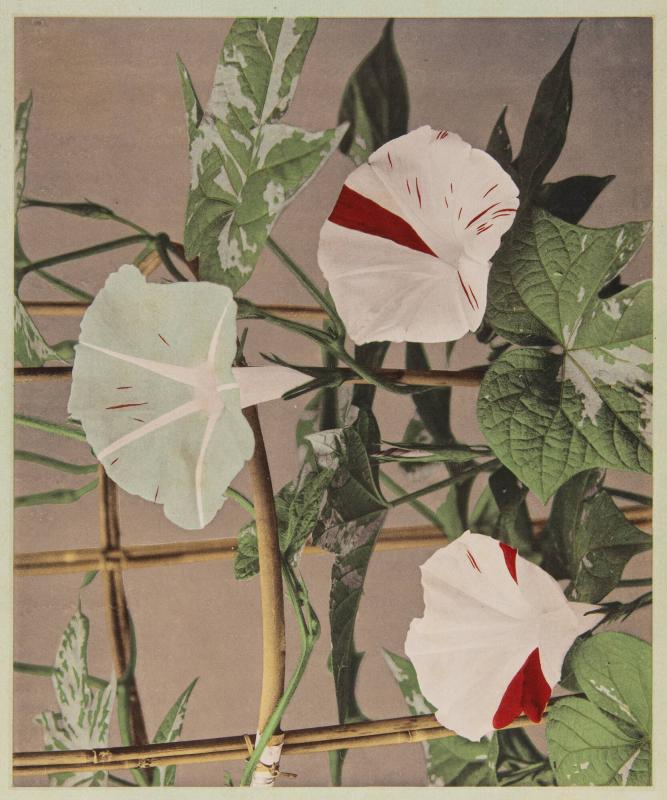
Three morning-glory flowers turn in different directions. One opens toward us, its pale funnel interrupted by a broad red stripe. Another presents its back, where the radiating ribs make a small star. Around them, leaves overlap bamboo supports in a tangle of stems, veins, and shadows. Ogawa Kazumasa’s Morning Glory, dated 1896 in Syracuse University Art Museum’s catalogue, gives each surface a different kind of presence: papery petals, firm stalks, soft darkness.[1]
The museum identifies the print as a collotype. That word names the work between the photographic negative and the finished sheet. The image reaches paper as ink, transferred from a plate prepared using light-sensitive gelatin.[2][3] Much of its delicacy depends on something that sounds like a defect: a fine, irregular network formed in that gelatin. At ordinary viewing distance, the network disappears into tone.[4]
Teaching a surface to take ink
A traditional collotype begins with a glass plate coated in sensitized gelatin. Exposure beneath a photographic negative hardens the coating according to how much light gets through. The clearer parts of the negative admit more light; the denser parts admit less. After washing, the less-hardened gelatin takes up more water, while the more-hardened areas are less receptive to it.[2]
This uneven relationship with water governs the next stage. Oily printing ink adheres preferentially to the exposed, hardened areas. The plate can then transfer that ink to paper. Light has prepared the printing surface; ink makes the impression.[2][3]
Imagine the pale inner curve of a flower beside the darkness behind a leaf. The printer needs those areas to carry different quantities of ink while preserving the transitions between them. Collotype provides a way to organize that difference across a surface, using the gelatin’s response to exposure and moisture. Its apparent softness is the outcome of material discrimination: neighboring areas behave differently.
The distinction also locates the gelatin. It is essential to the printing plate, but a collotype can consist simply of ink on paper. Some examples have additional coatings or prepared supports; gelatin need not be the layer carrying the finished image.[4]
The grain that refuses a grid
The Image Permanence Institute’s Graphics Atlas describes gelatin swelling, buckling, and reticulating during processing. Under magnification, a characteristic collotype has a winding, irregular grain, particularly noticeable in the middle tones. The pattern’s fineness varies with factors including the thickness of the gelatin coating.[4]
Compare this with a conventional letterpress halftone, whose tonal structure resolves into an ordered pattern of dots. In a collotype, the eye encounters a less regular distribution. Both can translate a photograph into printable marks, but the marks have different geometries.[3][4]
“Smooth” is therefore a description of the viewing experience, not proof that the image lacks structure. From a comfortable reading distance, tiny deposits of ink cohere into a petal’s shallow curve. Closer inspection of the physical print can reveal the means of that illusion. The photograph has become a pattern without looking patterned.
That does not mean this web reproduction lets us diagnose every technical feature. Resizing, compression, and the screen itself intervene between the object and our eyes. Here, the medium identification comes from the museum’s record. The reproduction lets us study the composition; it cannot replace examination of the sheet.[1]
A photograph that could travel
Collotype’s history belongs to publishing as well as photography. The University of Illinois’s preservation guide traces its beginnings to Alphonse-Louis Poitevin in 1855 and important improvements by Joseph Albert and Jakub Husnik in 1868. It found uses in books, postcards, and other printed images.[3]
Ogawa’s career makes that connection concrete. Historian Kelly M. McCormick describes his study of collotype in the United States and his establishment of a photographic reproduction business in Japan in 1889. He marketed collotype images individually and in albums, connecting photographic exhibitions to objects that viewers could purchase and take away.[5]
The opportunity came with a constraint. McCormick emphasizes that collotype’s fine tonal reproduction was expensive and suited to limited editions. Ogawa also worked with halftone printing as photographic publishing expanded.[5] Fidelity and circulation were related ambitions, with different production demands.
A flower print brings those ambitions down to the scale of a hand-held object. Its subject is perishable; its image can be multiplied. Yet multiplication does not make the choice of process disappear. The printed sheet must still persuade a viewer that the fragile curl of a petal is worth looking at slowly.
Red requires another explanation
The red stripes in Morning Glory invite an easy assumption: surely the process simply recorded the flowers’ colours. The label “collotype” does not establish that. Graphics Atlas documents several ways colour entered collotypes, including separate plates carrying different inks, hand colouring, and combinations with other printing methods.[4]
Syracuse’s concise record names the medium without specifying the colour procedure for this impression.[1] We should leave that particular question open. The vivid markings are visible; precisely how they were produced requires evidence beyond their appearance in a digital image.
That boundary makes the print more interesting to look at. Follow the veins across the large leaf at the right, then the broad red passage on the flower below it. Fine photographic description and emphatic colour share the same sheet. Understanding the tonal process gives us one part of its construction, while the colour asks us to keep investigating.
Collotype’s achievement lies in making the printer’s intricate surface work feel effortless to the viewer. We see a flower turning away, a stalk crossing another stalk, a shadow deepening behind a leaf. Beneath that easy recognition is a useful disorder, organized well enough to disappear.
Sources
- Syracuse University Art Museum, Ogawa Kazumasa, Morning Glory, 1896 — collection record, medium, credit, and image source; accession 1998.245.
- Victoria and Albert Museum, “An A to Z of photographic processes,” collotype section — negative exposure, gelatin hardening, water absorption, and ink transfer.
- University of Illinois Library, Preservation Self-Assessment Program, “Photomechanical Prints” — collotype history, materials, uses, and comparison with letterpress halftone.
- Image Permanence Institute, Graphics Atlas, “Collotype” — Magnification: reticulation, grain, and layer structure; Object View: colour processes, supports, and finishing.
- Kelly M. McCormick, “Ogawa Kazumasa and the Halftone Photograph: Japanese War Albums at the Turn of the Twentieth Century,” Trans Asia Photography 7, no. 2, April 28, 2017 — Ogawa’s training, publishing business, and the economics of reproduction.