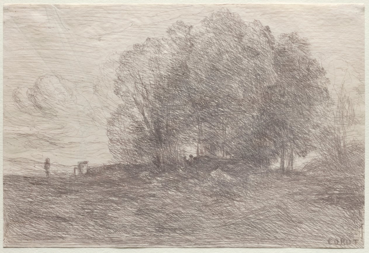
The trees arrive as a tangle. In Camille Corot's Group of Trees, dated 1858, brown lines gather into foliage, loosen into branches, and scatter across the foreground. The little figures seem almost caught in the same scribble. Across a sheet barely twenty-three centimeters wide, the hand's restless movement becomes a landscape.[1]
Look at a dark twig and imagine its earlier existence as a transparent scratch. That is the small reversal on which this picture depends. Corot made the design on glass; light carried it onto sensitized paper. Cliché-verre gave a drawing the reproducibility of a photographic negative while leaving the final appearance open to decisions made during printing.[5]
The basic operation is easy to picture. An artist covers a glass plate with an opaque coating, then draws through that coating with a sharp point. The prepared plate is laid over light-sensitive paper and exposed. Cleveland's account of the technique, accompanying Charles-François Daubigny's Deer, describes this sequence from covered glass to printed sheet.[3] The needle opens a route for light. It does not need to cut an ink-bearing groove into the glass itself.
On the resulting photographic print, those exposed passages become dark. Areas protected by the coating remain light. A conventional pencil stroke adds material to make a line; this scratched drawing removes material to produce one. The gesture feels familiar, but its physical meaning has changed. Even the untouched ground is active: it shields the paper that will become the picture's lightest space.[3]
Artists could also paint the negative. As Elizabeth Glassman's study explains, varying the thickness of an opaque varnish changed how much light reached the paper, producing gradations instead of a purely linear image.[2] A branch could be described by a scratch, a mass of shade by controlled transparency. The glass was a surface for arranging how light would pass.
There was a practical aid to this inverted way of drawing. In the Arras circle that introduced Corot to the process in 1853, a coating of printing ink could be dusted with white lead and the plate set over black cloth. Scratches then appeared dark against a pale surface, anticipating their appearance on paper. Corot also broke up the coating with a stiff wire brush to create dotted passages.[4] What looks spontaneous in a print could depend on a carefully prepared working surface.
The work was shared. Glassman documents how the photographer Adalbert Cuvelier and the drawing teacher Grandguillaume prepared and printed plates for artists visiting the painter and lithographer Constant Dutilleux in Arras.[2] This changes the imagined studio scene. The picture begins with an artist moving a point across glass, but it continues in another person's handling of paper and light. The signature identifies the designer without describing every judgment that brought the sheet into being.
That second stage offered considerable freedom. Conservator Kimberly Schenck describes how exposure, paper surface, fixing, and toning affected a print's density and color. Daubigny also experimented with the plate's position: placing its drawn face against the paper gave a sharp image; turning it over, or introducing another sheet of glass, softened the result.[4] The same marks could arrive on paper with a different edge.
Here a seemingly incidental thickness becomes expressive. Imagine reading a tree first as a set of crisp branches, then as a trembling mass. The design need not be redrawn for the balance between those impressions to shift. Sharpness is something made during the passage from negative to print. In this process, a faithful transfer of the marks still leaves room to interpret their atmosphere.
A documented comparison makes that freedom concrete. Writing for France's Institut national d'histoire de l'art, Victor Claass points to two posthumous impressions of Corot's Souvenirs d'Eza, a design from 1874, reproduced in André Marty's 1906 technical volume. One was printed with an additional glass plate between the matrix and the sensitized sheet, demonstrating the difference in rendering.[5] The example separates three moments that a short museum label can compress: making the design, printing an impression, and publishing that impression for another audience.
Those dates matter because a surviving plate lets the drawing travel beyond its maker's lifetime. A later print can transmit Corot's marks while also recording a later printer's choices. To describe every impression simply as the same image would lose the particular object through which the image becomes visible. The comparison invites attention to the sheet, its tone, and its edges alongside the named composition.
Return to Group of Trees. Its most absorbing passages let individual marks remain visible even as they accumulate into shade. The pale gaps between them keep the foliage from becoming a solid wall. At this scale, the eye can move easily between a grove and the restless lines that construct it.
The reproduction cannot establish the exposure time or exact printing arrangement used for this particular sheet; the museum's record does not supply them.[1] That limit is useful. Understanding the medium should make us more attentive to the object without turning every visible effect into an unsupported recipe.
Cliché-verre makes the interval between drawing and print worth looking at. The artist clears a line through a coating. The printer gives that opening a particular darkness, edge, and presence on paper. In Corot's grove, the resulting marks still carry the energy of a hand, after light has had its say.
Sources
- Cleveland Museum of Art, “Group of Trees,” Camille Corot, 1858 — object record, dimensions, support, collection credit, and the museum image reproduced above.
- Elizabeth J. Glassman, “The Cliché-Verre in the Nineteenth Century,” University of New Mexico, 1978 — thesis abstract describing drawn and painted negatives, the Arras collaborators, and the importance of individual impressions.
- Cleveland Museum of Art, “Deer,” Charles-François Daubigny, circa 1862 — collection record explaining the coated-glass, scratched-design, and photographic-printing sequence.
- Kimberly Schenck, “Cliché-Verre: Drawing and Photography,” Topics in Photographic Preservation 6, 1995, pp. 112–118 — materials, Corot's working methods, photographic variables, and Daubigny's printing experiments.
- Victor Claass, “« Mes pratiques impatientes. »,” Institut national d'histoire de l'art, updated August 19, 2024 — collection essay documenting the contrasting posthumous impressions of Souvenirs d'Eza published in 1906; in French.