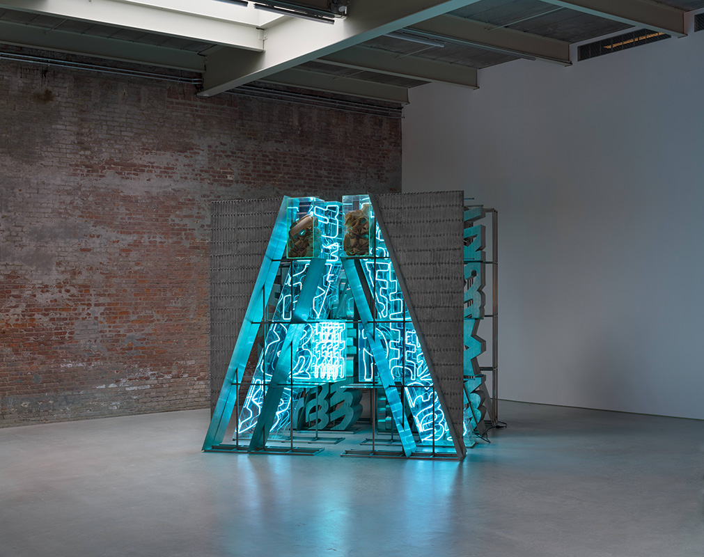
A sign usually rewards the quickest possible glance. Find the word, understand the instruction, move on. Chryssa made signs that frustrate that bargain. In The Gates to Times Square (1964–66), metal and neon retain the urgency of street advertising, but the message refuses to arrive. There is something alphabetic about the structure, something almost readable. The eye keeps trying.[5][6]
That hesitation runs through her career. Before she became known for neon, Chryssa worked with the shallow creases of packing boxes and the printed matter of newspapers. Across these materials, she found ways to separate recognition from comprehension. A letter could become a projection, a shadow, or a piece of architecture while remaining familiar enough to solicit another look.
Born in Athens in 1933, she grew up amid the Second World War. The Smithsonian’s biography connects her early awareness of letters and symbols to messages circulated by underground resistance groups. She later studied in Paris and San Francisco, and settled in New York in 1958.[1] These movements brought her into contact with very different visual environments. They also caution against treating her encounter with Times Square as the beginning of every idea she had about language.
New York nevertheless gave those ideas an extraordinary supply of material. Chryssa became close to artists and supporters including Agnes Martin, Betty Parsons, and MoMA curator Dorothy C. Miller.[1] Recognition came early: in 1961, a solo exhibition at Parsons’s gallery was followed by one at the Guggenheim.[8] The later story of an artist needing rediscovery should not erase this period of conspicuous achievement.
Her Cycladic Books offer an unexpectedly quiet entrance to that achievement. Documenta’s account, drawing on critic Pierre Restany, describes plaster cast against the inside folds of cardboard packaging. The resulting horizontal and vertical ridges suggested the simplified face of an ancient Cycladic figure: a brow and a nose emerging from a box’s construction. The twenty plaster works shown at documenta 14 were dated 1957.[2]
The encounter is wonderfully economical. A disposable container leaves behind a form capable of recalling an ancient object. Calling these reliefs books supplies another expectation: there ought to be something to read. Instead, the viewer receives a surface. Its sparse markings encourage the same patient scrutiny that a damaged inscription might demand, without promising a recoverable sentence. Antiquity and packaging meet in the act of looking for significance.
Light gives that search duration. The Menil’s conservation account explains that Chryssa’s early reliefs change as the sun moves or the spectator shifts position. The objects can remain still while their shadows alter. In Study on Light (1962), alphabetic forms become more or less apparent according to the illumination.[3] Looking is therefore partly a matter of where and when someone stands.
This is more than an attractive effect. The Menil found that standard, even photographic lighting could suppress parts of Study on Light’s surface; adjustments were needed to convey its depth more clearly.[3] Documentation itself encountered the difficulty that animates the art. A photograph can accurately record an object’s presence yet give an incomplete account of the conditions under which its forms become legible. Chryssa makes the supposedly neutral task of seeing unusually active.
Newspapers brought another kind of unstable reading. Beginning in 1958, she used discarded linotype printing plates, applying ink and paint and stamping them across paper or canvas. The Menil’s gallery guide identifies weather reports, crosswords, and tire advertisements among the material.[5] These were everyday structures for arranging attention: small units that told readers what had happened, what might happen, or what to buy.
A surviving work makes the process concrete. The Whitney lists Newspaper Page, Sock Advertisement (1959–1962) as a two-color relief print with oil and graphite on paper.[4] Its unglamorous subject matters. An advertisement for socks is already designed to disappear into the next purchase or the next edition. Preserving and reworking it interrupts that short life. The page becomes something to inspect after its original usefulness has drained away. Repetition begins to register as texture; information acquires a surface.
Neon expanded this interest into space. Chryssa worked with salvaged commercial letters and professional metal fabricators. For The Gates to Times Square, she built a capital-A structure divided by a narrow passage, with successive layers of metal and light. Paper templates used in fabrication sit inside a transparent box at the top.[5] The work preserves evidence of its making within its finished form.
In the photograph reproduced here, the sculpture seems to stand between a machine and an entrance. Its stacked components crowd together, while the opening gives the eye a route through them. Blue light draws attention toward the interior; the darker framework keeps asserting its weight. The letters have acquired too much depth to behave like lettering on a page. Looking across them becomes a negotiation between obstruction and access.
That is a useful way to understand the difference between borrowing a city’s appearance and working with its materials. The sculpture lets the physical support of a sign become as absorbing as the illuminated face. One can attend to the thickness of a section, the intervals between repetitions, or the way a curved element meets a straight edge. The promise of reading keeps bringing the viewer close; the construction supplies reasons to stay.
Her later obscurity also has a material dimension. Reporting on the 2023–24 Menil exhibition, Donna Tennant described the extensive conservation needed to bring the work back into public view. Curator Michelle White identified both the changing fortunes of light art and the fragility of neon; co-curator Megan Holly Witko discussed restoring The Gates after decades in storage.[7] These accounts offer specific obstacles rather than a single explanation for the decline of a reputation.
The survey, co-organized by Dia and the Menil, reunited neon sculptures with text-based paintings and works activated by natural light.[8] That breadth matters. It allows the luminous objects to be seen as part of a sustained investigation, with the quiet plaster surfaces still present in the story. Chryssa’s career becomes larger than the technology most readily attached to her name.
Return to the opening in The Gates. It offers a passage without resolving the mass of signs around it. Something similar happens across her work: the viewer is invited in, then denied the quick satisfaction of a decoded message. A discarded box, an obsolete advertisement, a letter removed from its sign can all hold attention again. Chryssa gives them time beyond the moment when they have told us what they mean.
Sources
- Gabriella Shypula, “Chryssa,” Smithsonian American Art Museum, 2024 — wartime context, artistic education, the 1958 move to New York, and artistic relationships.
- Documenta 14, “Chryssa,” 2017 — metadata for the Cycladic Books and an excerpt from Pierre Restany’s 1977 monograph on their cardboard-box origins.
- Desi Peters, “Changing Light of Chryssa,” the Menil Collection, June 13, 2017 — moving light, Study on Light, and the limits of standardized conservation photography.
- Whitney Museum of American Art, “Newspaper Page, Sock Advertisement,” collection record 72.140 — title, dates, and materials.
- Michelle White, Chryssa & New York, the Menil Collection gallery guide, 2023 — newspaper printing plates, fabrication, the structure of The Gates to Times Square, and its paper templates.
- David Charles Shuford, “Chryssa: Chryssa & New York,” The Brooklyn Rail, June 2023 — exhibition review and Bill Jacobson Studio’s photograph of The Gates to Times Square, with artwork and collection credits.
- Donna Tennant, “Coming into Light: Chryssa & New York at The Menil,” Arts and Culture Texas, October 10, 2023 — interviews with the curators on neon conservation, storage, and changing critical fortunes.
- The Menil Collection, “Chryssa & New York,” 2023–24 exhibition — the artist’s early solo exhibitions, the survey’s range, and its institutional collaboration.