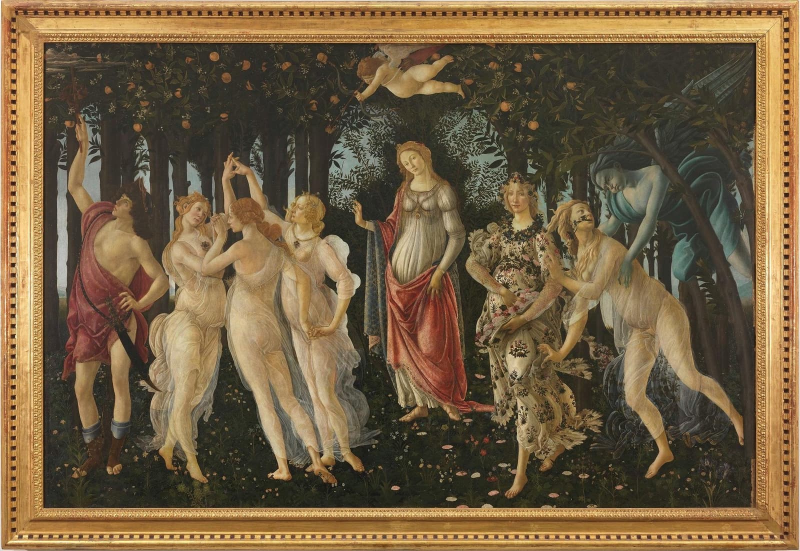
Botticelli’s Primavera is usually introduced as a puzzle of meanings: who exactly commissioned it, how literally to read the mythological cast, and whether its central logic is Neoplatonic, seasonal, dynastic, or all three at once.[1][3] That debate matters, but it can also distract from the painting’s more immediate achievement. Technically, Primavera works less like a window cut into springtime nature than like a deliberately built surface for sustained looking: figures arranged almost in a lateral frieze, a dark grove flattened into ornamental density, and a paint system that sharpens edges rather than dissolving them.[1][3] Britannica’s summary also underscores the painting’s probable Medici commission context, which makes that room-scale, image-object quality feel less abstract and more like part of the work’s original social setting.[3]
That is where the medium matters. The Uffizi identifies the work as tempera grassa on wood, roughly 207 × 319 cm, dating to about 1480.[1] In practice, that combination helps explain why the picture feels so crisp, staged, and almost textile-like. Instead of asking the panel to produce deep atmospheric recession, Botticelli turns it into a controlled field where gesture, contour, fabric, hair, leaf, and flower all stay available to the eye at once.
The support pushes the painting toward designed surface
The first useful fact is simple: Primavera is painted on poplar wood, not canvas.[1] That matters because support choice is never neutral at this scale. A large wooden panel invites a different visual contract from a large canvas. It favors stability, crisp contour, and a more object-like presence on a wall. You do not experience it as a slice of open air. You experience it as a made thing with a front.
The comparison sitting inside the Uffizi’s own Botticelli pages is revealing. The museum notes that The Birth of Venus was painted on canvas, a support widely used in the fifteenth century for decorative works destined for noble houses.[2] Primavera, by contrast, stays on wood.[1] The result is not just a different material fact but a different visual tempo. Birth of Venus opens outward with sea air and a cleaner figure isolate. Primavera holds the eye in a denser register: darker vegetation, tighter spacing, more repeated detail, more pressure on the surface.
That density is why the painting can feel woven before it feels narrative. The grove behaves almost like a patterned backing. The trees do not simply recede; they accumulate.
Tempera grassa keeps edges alive
Calling the medium “tempera grassa” is important because it places the work in a mixed technical zone rather than a single pure-medium stereotype.[1] The painting does not read like later oil-driven softness, and it does not rely on haze. Instead, the image holds together through exact edge management: Mercury’s red drapery, the transparent veils of the Graces, Flora’s flowered dress, and the orange leaves all stay sharply legible as separate events.
This is a big reason the composition survives reproduction so well. Even when seen in books, posters, or low-resolution screens, the painting keeps its identity because Botticelli organizes attention through contour and interval. Each figure occupies a distinct visual lane; each costume carries its own rhythm; each local cluster of detail feels bounded enough to scan without collapsing into blur.
That boundedness also helps explain why the painting never quite behaves like a naturalistic woodland scene. The technical goal is not immersive atmosphere. It is controlled simultaneity: many things visible at once, none surrendered entirely to depth.
The painting is built to be read sideways
The composition’s staging makes the technical program even clearer. Reading from right to left, Zephyrus presses into Chloris, Chloris becomes Flora, Venus anchors the center, Cupid interrupts the air above, the Three Graces rotate in a loop, and Mercury closes the sequence.[1][3] The figures do not rush into perspectival space; they articulate a lateral chain.
This sideways readability is one reason Primavera feels closer to court pageant, cassone decoration, or tapestry logic than to the later Renaissance ideal of a unified deep picture space.[4] Botticelli wants the viewer to move across the panel the way the eye moves across embroidery, procession, or staged performance. The technique supports that decision. Crisp figure separation, repeated botanical punctuation, and the dark vegetal screen behind the actors all keep the panel operating as a rhythmic band.
That is also why the work’s famous “difficulty” is overstated. Its iconography may remain partly contested, but its viewing system is remarkably clear. You do not need to solve every allegorical key to understand how the picture works. It teaches you how to look by distributing attention in a sequence of readable surfaces.
Botanical overload is part of the engineering
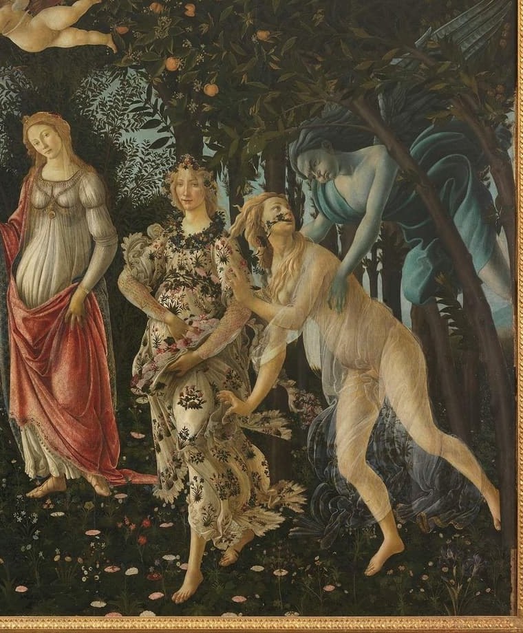
The Uffizi notes that at least 138 plant species have been identified and that Botticelli rendered them with striking accuracy, perhaps with the help of herbaria.[1] That detail is often quoted as proof of symbolic richness. It is also evidence of technique. The flowers and leaves are not decorative surplus. They are the fine-grain texture that keeps the painting active when the larger figure drama pauses.
In other words, the vegetation does two jobs at once. Iconographically, it supports spring, fertility, renewal, and Medici-adjacent garden culture. Visually, it prevents the dark grove from becoming dead background. Every blossom reactivates the surface. Every orange, leaf cluster, and floral stitch keeps the eye from sliding too quickly past the panel.
The Uffizi also notes that the grove’s darkness is partly the result of pigment ageing.[1] That matters because it slightly sharpens the modern experience of the work’s figure-ground contrast. What we now read as an especially dark decorative surround is partly historical change, not only original intention. The painting’s present power therefore comes from both Botticelli’s design and the work’s material afterlife.
One useful way to test that claim is to zoom into Flora’s dress and the adjacent grove. At that scale, the painting stops behaving like background-plus-figure and starts behaving like a woven relay of outlines, petals, leaves, and fabric accents, each local decision keeping the surface awake.
Reproductions hide how public the panel really is
One thing modern viewers routinely miss is how hard Primavera is to experience at its intended social scale through screen-sized reproduction. At roughly 207 × 319 cm, the work is not just detailed; it is room-commanding.[1] That matters because the painting’s “surface logic” is not miniature preciousness. It is public legibility. From a few steps back, the lateral band snaps together into one civic-sized image of grace, abundance, and managed order; from close range, the botanical and textile detail breaks that order back into hundreds of crafted decisions.
That oscillation—big ornamental signal from afar, restless hand-built density up close—is a large part of why the painting still feels so controlled. It is not merely full of symbols. It has been engineered to reward shifting distance.
Why the technique changes the meaning of the picture
Once you start from medium and support, Primavera stops looking like an overcomplicated allegory that happens to be beautifully painted. It looks like a deliberately engineered domestic image-object: large enough to dominate a room, precise enough to reward close inspection, patterned enough to hold attention over time, and materially tuned for surface presence rather than illusionistic depth.[1][2]
That does not settle the painting’s meaning. It clarifies its operating system. Primavera persuades not by making myth feel natural, but by making arrangement feel inevitable. The panel’s scale, wood support, tempera-grassa precision, and botanical density all work together to produce a public image of order, abundance, and cultured control. That is why it still reads so strongly. Even before interpretation begins, the painting has already won the eye.
90-second gallery looking drill
If you pull the image up full-screen—or stand in front of the painting and want a cleaner way to test the article’s claim—try this sequence:
- Ignore iconography for the first ten seconds: just trace the lateral spread from Zephyrus to Mercury and notice how little the picture depends on deep recession.
- Then look only at edges: veils, hair, orange leaves, flower heads, and Mercury’s drapery will show you how much the painting’s grip comes from contour staying active.
- Finish by comparing figure rhythm to grove rhythm: the people are legible because the botanical field never becomes dead background; it keeps pulsing like patterned fabric behind them.
- Then change viewing distance once: step back a few body lengths to feel the panel lock into one decorative band, then move closer again and watch the flowers, veils, and leaf edges break that band back into hundreds of hand-built decisions.
Sources
- Uffizi Galleries, artwork page — Spring by Botticelli
- Uffizi Galleries, artwork page — The Birth of Venus by Botticelli
- Encyclopaedia Britannica — La Primavera by Sandro Botticelli
- Wikipedia overview — Primavera (Botticelli)
- Uffizi image asset as surfaced on the official artwork page (main reproduction used for article image)