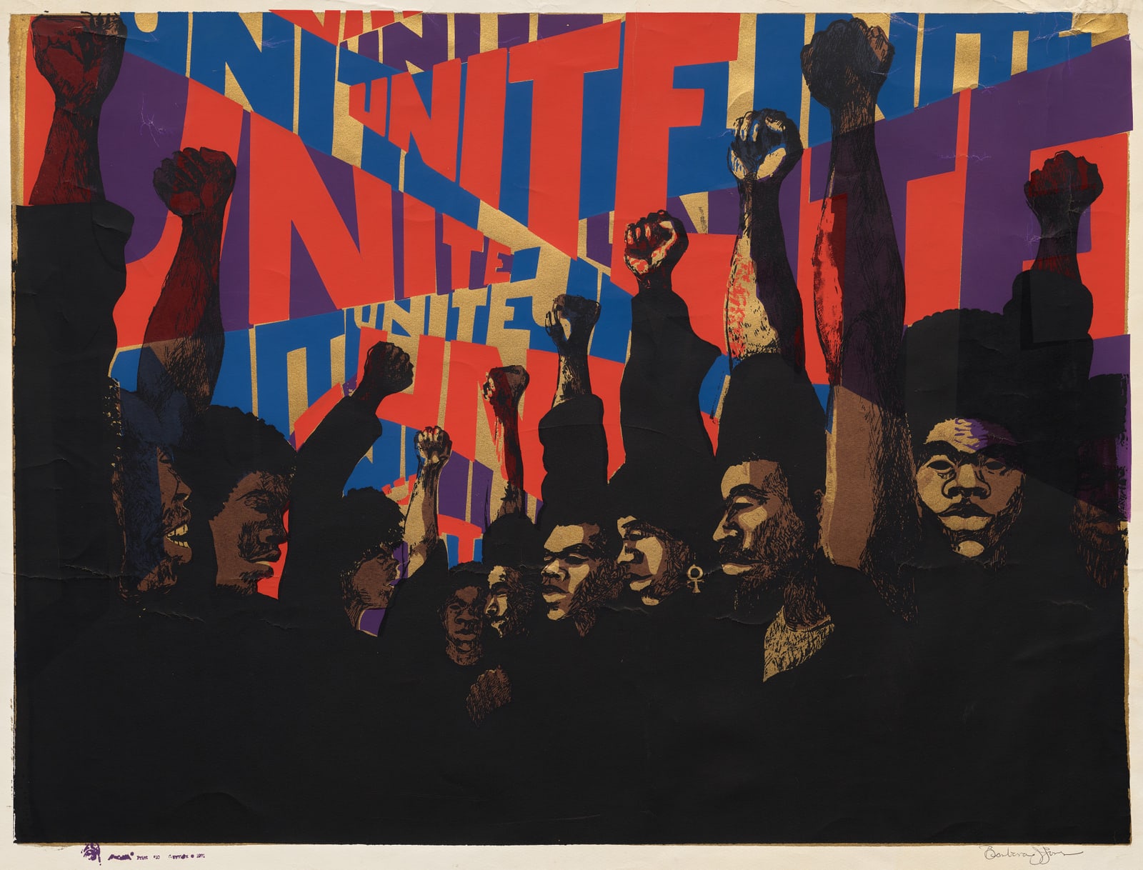
The first thing Unite does is refuse a quiet background. Red, blue, purple, and gold letters press across the sheet at competing scales. Some are broad enough to become architecture; others are squeezed into the intervals. A crowd rises in front of them, dark clothes gathering into a near-continuous base while faces and clenched fists interrupt the color above. The word UNITE does not caption the people. It gives them visual weather.[3][4]
Barbara Jones-Hogu's screenprint is one of the clearest entrances into AfriCOBRA, the Chicago collective founded in 1968. It is also a warning against reducing the group to a palette plus a Black Power salute. AfriCOBRA's deeper achievement was to treat style as a public language: a set of shared devices that could carry political thought across different artists, media, rooms, and neighborhoods. The members wanted family resemblance without sameness, legibility without obedience to a white art establishment, and collective force without pretending that every Black experience spoke in one voice.[1][2]
A wall teaches the first lesson
AfriCOBRA began after several of its future members had learned what a public image could do at street scale. In 1967, artists in the Visual Arts Workshop of the Organization of Black American Culture created the Wall of Respect at 43rd Street and Langley Avenue on Chicago's South Side. Its portraits of Black cultural and political figures turned the side of a building into a gathering place and an assertion of who deserved monumental visibility.[1][7]
The next year, Jeff Donaldson, Jae Jarrell, Wadsworth Jarrell, Barbara Jones-Hogu, and Gerald Williams formed the collective that became the African Commune of Bad Relevant Artists. Their problem was no longer simply how to fill another wall. It was how to make a visual address recognizable across separate works. The University of Chicago's history of the group describes a philosophy built collectively around positive revolutionary ideas, African heritage, solidarity, and self-determination. It also preserves the group's desire to move from the isolated “I” toward the social “we.”[1]
That ambition explains why AfriCOBRA belongs in movement history rather than in a roundup of similar-looking pictures. The artists did not stumble upon the same bright colors. They met, argued, named principles, tested them, and revised their work in relation to one another. Style became a form of organization.
Unite reads before it explains
The Cleveland Museum of Art dates Jones-Hogu's design to 1969 and this color-screenprint impression to 1971. The museum notes that she produced the layered color and text herself.[3] That manual construction is visible. The letters do not sit in a clean typographic line; they expand, collide, repeat, and change direction. Their scale creates a beat before the viewer finishes reading the word.
The figures answer that beat. Raised forearms establish strong verticals, but the fists land at different heights. Faces turn sideways, forward, and toward one another. Repetition produces solidarity while variation keeps the crowd from becoming an emblem without people. The Smithsonian's close reading points to the Afros, the raised-fist gesture, and an ankh worn by one figure as signs of Black pride, resistance, and a shared African inheritance.[4] Yet the print's argument is carried as much by composition as by iconography. Unity appears as coordinated difference.
This is why the image remains forceful even when its message seems immediately clear. A weaker poster would state a command and stop. Unite makes the command happen formally. Letters overlap but stay readable. Bodies merge at the base but separate through faces and hands. The sheet holds together because its parts do not become identical.
Shared rules, different hands
AfriCOBRA gave names to the qualities its members were pursuing. Wadsworth Jarrell's account describes Cool Ade color as intense color held in harmony, free symmetry as repetition with change and syncopated rhythm, visibility as clarity animated by irregularity and human touch, and writing on the plane as language with the impact of poster or billboard art.[2] These were not neutral design tips. They connected visual form to Black clothing, speech, music, movement, and neighborhood life.
The distinction between grammar and template matters here. A template tells every maker where each element must go. A grammar gives makers relations they can vary. Jones-Hogu could turn a single verb into a crowd's atmosphere. Wadsworth Jarrell's Revolutionary built a portrait of Angela Davis through radiating words and repeated letters, then moved that image into poster form. Other members worked through painting, print, collage, textile, and clothing while retaining different hands and emphases.[2][4]
AfriCOBRA therefore challenged two familiar myths at once. The first is the myth of the solitary artist whose style arrives untouched by conversation. The second is the idea that collective purpose requires anonymity. The members shared an argument about address, not one compositional stencil. Their coherence came from returning to common questions: Who is the image for? Can it speak directly? Does its rhythm feel lived rather than imported? Can another person carry it away?
Screenprint changes the address
That last question makes the medium of Unite politically important. A mural gathers a public around one site. A screenprint can travel. Jones-Hogu still had to separate colors, register layers, pull ink, and make each impression; reproducibility did not eliminate craft.[3] It changed the possible route between studio and viewer.
Accounts of AfriCOBRA's Chicago reception place its posters in parks, festivals, barbershops, stores, and homes—not only in museums.[5] Rebecca Zorach situates that circulation within a wider South and West Side art world that used murals, community art centers, film, and print as forms of service amid segregation, disinvestment, and racist urban planning.[7] In that setting, “public” was not an abstract synonym for everybody. AfriCOBRA addressed Black viewers first, building images of self-definition where mainstream media and cultural institutions had supplied caricature, absence, or someone else's standards.
This did not place the work outside economics. Paper, ink, labor, venues, and distribution still had costs. The more precise claim is that reproducible media let the collective reroute cultural value. A poster seen in a barbershop could enter daily life before a museum certified it. The image did not have to wait for institutional permission to become consequential.[5]
Positive is a contested word
AfriCOBRA's commitment to “positive images” can sound softer now than it was. Unite is not cheerful decoration. Its fists are defiant, its color is pressurized, and its crowd claims agency. Positive meant opposing a representational system that habitually described Black life as deficiency. It meant making strength, beauty, kinship, historical memory, and political capacity available as subjects.[1][4]
The term also deserves scrutiny rather than reverence. A program of uplift can decide which roles count as exemplary. Jones-Hogu's Black Men We Need You, also from 1971, answered contemporary arguments that blamed racial inequality on Black family structure by asserting the importance of men to the family.[6] The work can be read as a direct repair to a damaging public narrative; it can also remind us that affirmational art may carry prescriptions about gender and family. Those readings need not cancel each other.
Keeping that tension visible improves the movement's history. AfriCOBRA's principles were tools developed in a specific political struggle, not a timeless checklist for authentic Black art. Their strength came from collective debate and use. Treating them as fixed doctrine would drain away the experimental quality that produced them.
A language survives through variation
AfriCOBRA's visual grammar still feels unusually alive because it joined message and method so tightly. Color was not a coating applied after politics. Rhythm was not an allusion added for atmosphere. Text was not an explanatory label. Each was a way to organize attention and establish a relationship with a viewer.
In Unite, that relationship begins before the word is fully parsed. The eye meets color, then cadence, then bodies, then language, and keeps cycling among them. Jones-Hogu does not illustrate collective action from a distance. She builds a surface in which every element must repeat without disappearing.
That is the movement's most durable lesson. A shared style can do more than identify a group in art history. It can create a public language—provided the rules are strong enough to be recognized and open enough for many hands to speak through them.
Sources
- Logan Center Exhibitions, University of Chicago, “AFRICOBRA: Philosophy” — founding members, the Wall of Respect, collective ethos, and the movement's stated themes.
- Wadsworth A. Jarrell, AFRICOBRA: Experimental Art toward a School of Thought, Duke University Press, 2020 — introductory excerpt on the collective's history, visual principles, media, and cultural syntax.
- Cleveland Museum of Art, “Unite” — object date, medium, dimensions, production note, provenance, and source page for the museum photograph used here.
- Smithsonian American Art Museum, “Oh Freedom! Barbara Jones-Hogu” — formal reading of Unite, AfriCOBRA context, and related discussion of Wadsworth Jarrell's Revolutionary.
- University of Chicago News, “Three-part exhibition recollects and reconsiders AFRICOBRA movement” (May 3, 2013) — community distribution, printmaking, household display, and the South Side cultural ecosystem.
- Studio Museum in Harlem, “Black Men We Need You” — object record and historical framing around Black family representation and the Moynihan Report.
- Rebecca Zorach, Art for People's Sake: Artists and Community in Black Chicago, 1965–1975, Duke University Press, 2019 — official book page on community art, public space, and the urban conditions of Black Chicago.